Introduction
One of the most effective methods for identifying bottlenecks and increasing efficiency and profitability in business processes is to analyze them. Qflow offers dashboards that allow you to see the status of processes and tasks in real-time. This makes them a very useful tool for monitoring the organization’s processes.
A summary of views, charts and indicators
Qflow provides several components for the tracking and analysis of processes. These allow presenting process information in the most convenient way for each specific case. The components can be:
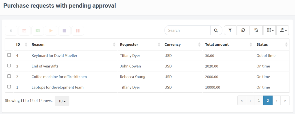
- Views: a table that shows the process information that we want to see.
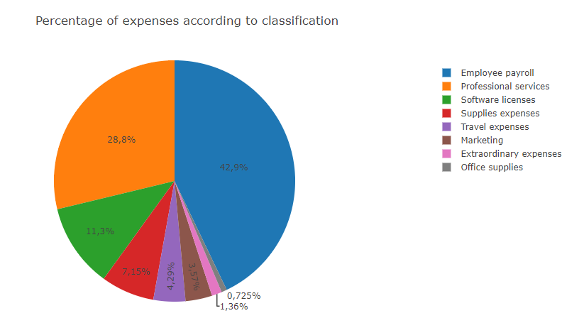
- Charts: graphical representation of process data. They can have different apprearances, such as bar charts, pie charts, dispersion charts, line charts, among others.
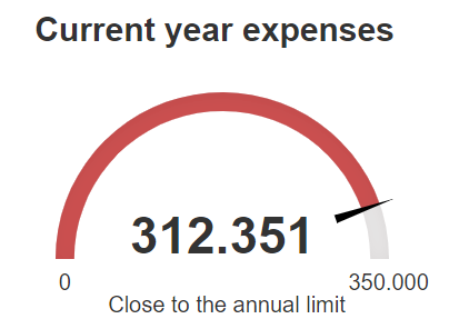
- KPIs or indicators: key performance indicators. They show a calculated data in a synthesized form and, in comparison with expected ranges, provide valuable information about business processes.
Usefulness of dashboards for monitoring and decision making
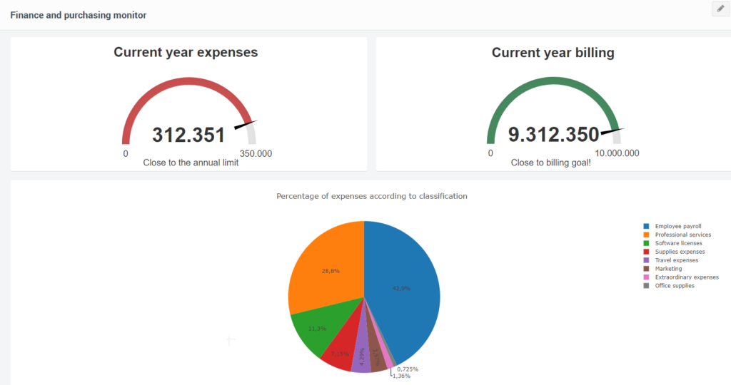
The previously mentioned components can be accessed individually, but a dashboard allows grouping all the information in a single place. In this way, it is possible to quickly obtain a complete overview of a process, sector, or even the current status of the organization’s goals. Additionally, this functionality is ideal for monitoring process time, identifying deviations and taking corrective actions before they become a problem.
Qflow allows creating an unlimited amount of views, charts, KPIs and dashboards. They can be configured to be accessed by team members or the entire organization, or they can also be marked as personal.
Examples of dashboards customized by the role of each user
The customization power of dashboards allows them to be used for different purposes depending on each person’s role in the organization. In this way the CEO, the team leader and even the accounting assistant can improve their daily efficiency by taking advantage of this functionality.
CEO’s dashboard example
For example, the organization’s CEO may be interested in accessing indicators on the real-time status of the company’s annual goals. If the goals were set to have a billing value greater than 10 million dollars and customer satisfaction above 85%, their dashboard could contain:
- A KPI or indicator that shows the average customer satisfaction, which could be calculated based on complaint processes, incident management, or customer service satisfaction evaluation data.
- A KPI that presents the to date yearly billing value, whose information could come from sales processes.
- A chart showing the projected billing value for the year by month, based on completed sales processes and those that are still opportunities with a confidence level greater than 85%.
Purchasing manager’s dashboard example
A purchasing sector manager in a production company, on the other hand, may be more focused on monitoring, analyzing and taking action if necessary within their sector. Their dashboard could contain:
- A KPI that shows that purchasing expenses do not exceed the defined budget. This information could be easily extracted from the purchase request processes.
- KPIs that show the average cycle time for purchasing raw materials, including the phases of request, approval, pricing, supply and invoicing.
- A chart showing the concentration of purchases by suppliers. This can be useful for analyzing potential risks, as if a key supplier of raw materials is unable to supply or has delays, it could generate disruptions in the supply chain.
- A KPI indicating the percentage of payments made within the established deadline.
Team leader’s dashboard example
Finally, for the case of a team leader in the Purchasing sector, it could be useful to have an overview of their team’s tasks. One of their dashboards could contain:
- A view with the list of ongoing purchasing and procurement tasks, indicating who on the team they are assigned to, ordered by priority.
- A chart showing the number of tasks in progress per person.
- A chart showing the number of completed tasks for the month per person.
- KPIs indicating the number of purchases that are on time and overdue.
- A view indicating the team’s tasks that are approaching their deadline.
How to personalize Qflow Task to make monitoring easier?
Qflow offers the possibility of creating customized dashboards, which allows adapting the tool to the business needs instead of adjusting the company’s operations to the tool. In addition, Qflow Task is completely customizable for each user, as it allows:
- Marking the most relevant views, charts, KPIs and control panels as highlighted, making them easily accessible from the menu.
- Selecting the default home page for each user. This way, a team leader could directly access a dashboard that indicates the status of the team’s tasks, while an accounting assistant could see a screen with pending invoicing tasks ordered by importance and urgency.
- Marking system pages as favorites, to access them directly from the menu.
Conclusion
In summary, dashboards are a very useful tool for monitoring business processes in real-time. They are a fundamental pillar for process performance improvement, as what cannot be measured cannot be improved.
The components of views, charts and indicators provide a complete view of processes, allowing users to identify deviations and take immediate corrective measures.
Furthermore, the power of dashboard personalization allows them to be used for different purposes according to each person’s role in the organization. Qflow offers the possibility of creating unlimited and personalized dashboards, which facilitates process monitoring and analysis of key information for decision-making in the organization.
If you are interested in discovering the true value of Qflow dashboards for your organization and how they can help you make more informed decisions, we invite you to contact us and schedule a demo. We will be happy to advise you and answer any questions you may have.

