Qflow Task
Introduction
The purpose of this manual is to explain how Qflow Task works. This site is the tool that allows users to start processes, interact with them and see their information.
Manual organization
This manual is divided into the following parts:
Qflow Task’s description: it briefly describes the site, its structure and the relationship between each of its parts and Qflow’s functionalities.
Working with flows and tasks: it describes how to start flows, respond to tasks and track running flows. It also explains how work queues work. These allow you to assign tasks to a group of people (for example, a company’s department or the employees that work in the same office), and they help divide the work efficiently.
Flow monitoring and analysis tools: it explains how to use views, charts, indicators, and dashboards. These tools allow you to organize and visualize the flows’ information to facilitate their monitoring and control.
Administration and configuration: it explains how to perform administration and configuration tasks, how to define access permissions to the different sections and elements of the site, manage the links of the sidebar menu, manage device notifications and define how work queues are displayed.
Qflow Task’s description
Fig. 389 shows the Qflow Task as it is seen by a user with all permissions when Qflow is freshly installed.

Fig. 389 Qflow Task
Qflow Task’s home page is, by default, a dashboard, which can be modified to add graphs, indicators and views, as shown in the Flow monitoring and analysis tools section. To access the home page from any other page in the site, you can click on the Qflow Task logo, on the upper left corner.
Qflow Task has two menus: a sidebar menu, to the left, and an upper menu, which is located in the upper right corner.
In the upper menu (Fig. 390), the following links are shown:
My tasks: it allows you to access the list of tasks that await user action, the user does not necessarily have to have viewing permissions in the corresponding package. The number appearing in a red-colored background indicates the number of tasks. From this list you can access the forms that allow you to respond to them. Additionally, it has a quick response feature that allows you to select one or multiple tasks and respond to them quickly, as explained in the Quick response.
My flows: it allows you to access the list of flows started by the current user.
My notifications: it allows you to access the notifications that have been sent to the user. It is common for these notifications to be sent to the user by email. In any case, the user can access them in the Qflow Task through this link.
My favorites: it shows a view of favorite links and allows you to modify this list. It also allows you to choose the home page. It has a submenu with the following options:
Set this as my home page: it sets the current page as the home page. If you hover the cursor over this option, an extra icon appears (
 ) which allows you to restore the default home page.
Links: following the option to set the current page as the home page are the links that have been added as favorites. If you hover the cursor over any of the existing links, an extra icon appears (“
 ”) which allows you to delete the link from favorites.
Add to my favorite links: it adds a link to the current page into the favorite links list.
Configure: it allows you to access the configuration options. These are described in the Administration and configuration section.
About: it shows the current system version, as well as a link to the manual, the product news and the Qflow forum.
Tools: When pressed, it will display a list of options with the different tools available in Qflow. By clicking on an option, the corresponding tool will open in a new tab in the browser.
User menu: Allows you to enable or disable notifications, sign out, and access your time zone settings. For more details, see the time zone management section. For more information, check the section: ref:Time zone management.
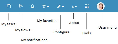
Fig. 390 Upper menu
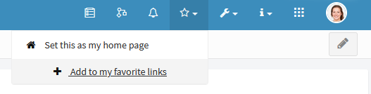
Fig. 391 Favorites editing
The sidebar menu shows several options with their names and icons that represent them. The names can be hidden, which reduces the menu’s size and shows only the icons. To do this, you must click on the icon that appears in the upper left corner, next to the Qflow Task logo (Fig. 392).
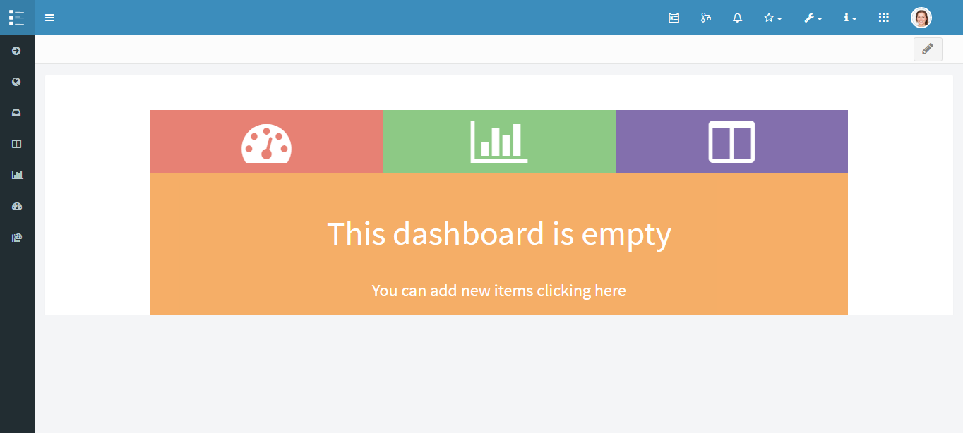
Fig. 392 Qflow Task with collapsed menu
The default options for the sidebar menu are the ones shown on the following list, however, the items of this menu can be customized. Keep in mind that these elements may be visible or not visible, depending on the user’s permissions.
Search: it allows you to type to search flows or sidebar menu elements. When you start typing on the text box, a list is displayed showing those elements from the menu whose titles contain the typed text. Also, an option is shown that reads “Search flow:” followed by the typed text. If this option is selected, Qflow searches the flows that contain the typed text in some of their “Flows” view columns and shows them in that view (doing this is equivalent to opening the “Flows” view and performing the same search there). If the entered text has any special format corresponding to a specific data type (such as a date or a number), the values of that type’s columns are compared with the entered text, including them in the result if they are equal to it and not if they contain it. For example, if the number 23 is entered, the flow whose ID is 23 will be shown in the search result, because its value is a number that matches with the number 23. But the flow whose ID is “223” will not be shown, even though the number “23” is contained (except in the case that “23” exists in any other column of the view for that flow; for example, in a flow’s description). That is because the ID column stores numeric type data.
General: this option has the following sub options:
Main dashboard: it allows you to access the main dashboard (see Dashboards). It is created by default in Qflow and has no content.
Flows: it allows you to access the list of flows that the user has permission to view. It can include flows that were not started by them, unlike the “My flows” view, which is available through the upper menu. Flow views like this one are described in the Working with flows and tasks section.
Tasks: it allows you to access the list of tasks that the user has permission to view. This can include tasks that are not awaiting action from the user, unlike the “My tasks” view, which is available through the upper menu. The tasks views are described in the Work with tasks section.
Notifications: it allows you to access the list of notifications that the user has permission to view. This can include notifications that were not sent to the current user, unlike the “My notification” view, which is available through the upper menu.
Tasks responded by me: it shows a list of tasks that have been responded by the current user.
Work queues: it allows you to access a page that shows the work queues in which the user has permission to act. These same work queues appear as suboptions, meaning that the user can directly access each one of them. Work queue views are described in the Work queues section.
Views: it allows you to access the views page. Views are described in the Views section. The suboptions are the views for which it was defined that they should appear in the menu and that the user has permission to see.
Charts: it allows you to access the charts page. Charts are described in the Charts section. The sub options are the charts for which it was defined that they should appear in the menu and that the user has permission to see.
Indicators: it allows you to access the indicators page. Indicators are described in Indicators. Displayed as sub options are the indicators for which it was defined that they should appear in the menu and that the user has permission to see.
Dashboards: it allows you to access the dashboard page. Dashboards are described in Dashboards. The suboptions are the dashboards for which it was defined that they should appear in the menu and that the user has permission to see.
General user interface operation
This section describes general aspects of the user interface operation in the site. Most of the site shows element lists, such as, a package’s flows, in tables (Fig. 393) or a set of icons that represent the elements (Fig. 395) inside the box.
In both cases, inside the box that contains the list are two groups of buttons. The first one, on the left, allows you to perform operations on the elements that are shown. The second, to the right, allows you to refresh the list of elements, search for elements and in some cases, apply complex filters and modify the way in which they are shown.
Execution of operations
To perform an operation on an element, there are two options:
Select it and click on the button that corresponds to the operation (Fig. 394). To select an element:
If it is an element displayed in a table, such as a flow, click anywhere inside the row corresponding to that element.
If it is an element shown as an icon (for example, a template), click on the element, but outside of the icon that represents it. If you click on the icon, the default operation will be executed. For example, in the case of a template, when you click on the icon a form is displayed which allows you to start a flow based on the template. In the case of work queues, the inbox of the queue is displayed.
Right click on the element. This makes Qflow display a context menu in which you can select the desired operation.
When the elements are displayed in a table, the first column contains checkboxes that can be checked. If several are checked, and you select an operation that can be applied to several elements (for example, pausing or ending flows), this will be applied to all selected elements.
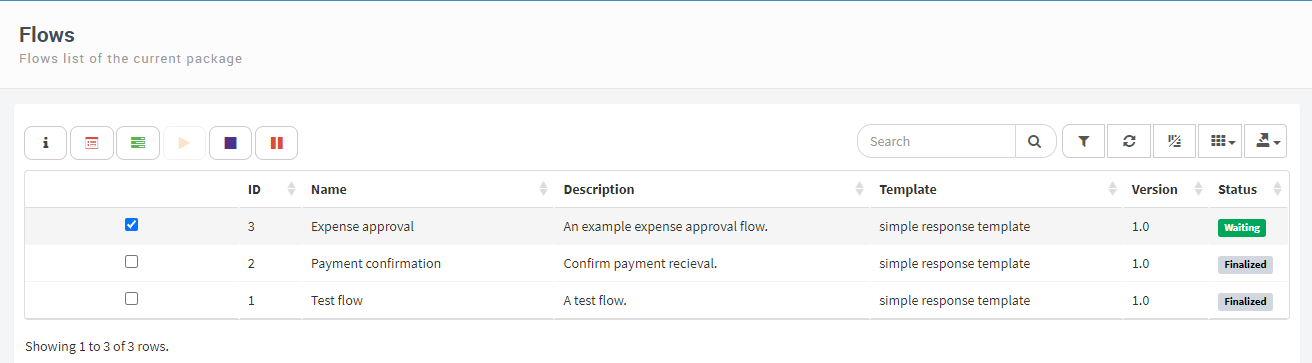
Fig. 393 The “Flows” view, like all flow views, is displayed as a table.
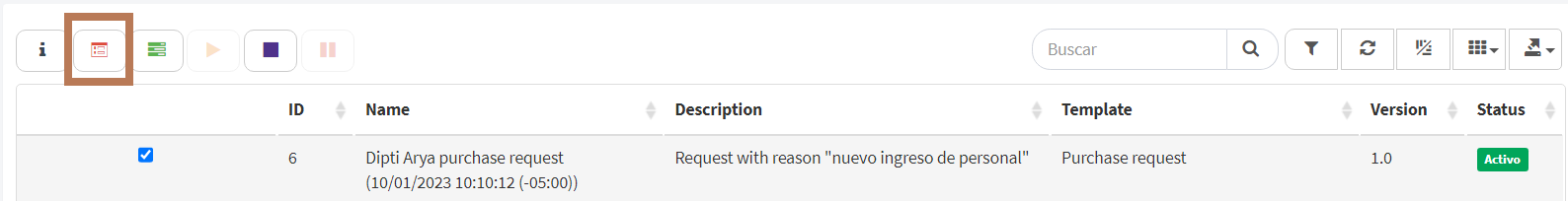
Fig. 394 Execution of an operation
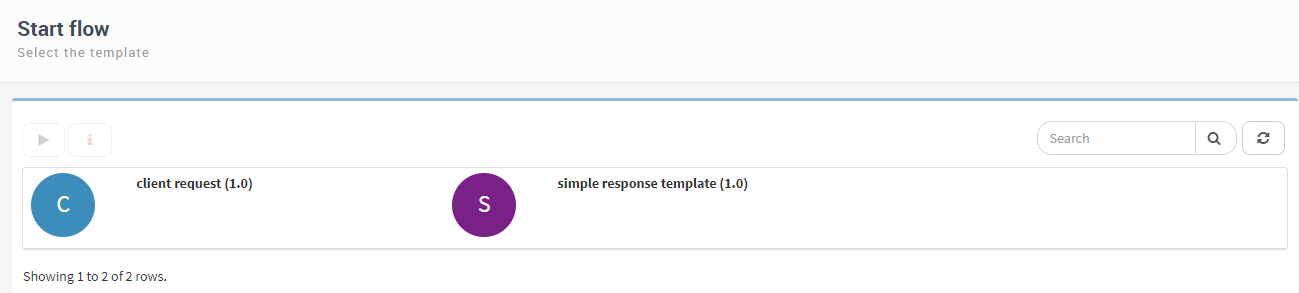
Fig. 395 Template views show icons instead of table rows.
Search, view and filter options
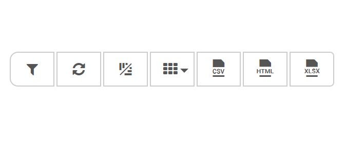
The buttons that are grouped over the box that shows the list of elements allow you to modify what is shown in the list and, in some cases, how it is displayed. Fig. 398 shows a close-up of that part of the screen, with a brief description of each button. The options for searching and refreshing the list are available for all lists. The rest are only available when the lists are shown as tables. Next, each one is described in greater detail:
Search: it allows you to enter text. Qflow will filter the view, showing only those elements that contain the entered value in text type columns, or those that have, in columns of different type, values equal to the one represented by the entered text (for example, if a number is entered, Qflow will compare the ID of each flow of the list, which is a number, with the entered number; see the description of the sidebar menu’s “Search” element, further above). Some application data is associated to domains that get information that is stored outside of Qflow. The values of this data are identifiers that are stored in Qflow and are associated with descriptions, which are stored outside of Qflow. Qflow does not use those descriptions to filter views.
Apply advanced filter: it allows you to filter the view using complex expressions, for example, “All flows that belong to the ‘Client application’ template, that were started between 1/1/2016 and 1/1/2017”, or even more complex. This is useful when the filter available through the “Search” option is not enough. A detailed explanation on how to define an advanced filter is given in the views section (see Views). An advanced filter works like a view filter, except that the advanced filter can only use columns from the view to which it is being applied, while when you define a view filter you can choose which columns to use to create the filter. In the case of the advanced filter then, no columns are selected, instead conditions and groups of conditions are defined using the columns that appear in the view.
Refresh View: it updates the screen that is showing the view to reflect any changes that may have occurred since the page was refreshed for the last time, or since the page was entered.
Rows/Columns: it changes the way of showing the view: each element of the view is shown in a row that, at the same time, has several sub rows, one for each column of the view. Fig. 399 shows the same view with the same elements as Fig. 393, but after clicking on the button. If the button is clicked again, it returns to the original format. This is especially useful in the case of small screens, or having so many rows that not all of them fit in the screen.
Select columns to show: it shows the list of the view’s columns, with checkboxes that can be unchecked to hide or show any of the columns (Fig. 400).
Export: it exports the content of a listing to a file (CSV format, HTML and Excel) in the user’s computer.
By default, export operations are shown as options grouped in a single action button that displays a list of export options (as shown in Fig. 397), but it can be configured to be shown as separate options (as shown in Fig. 396). To configure this preference, see the installation and configuration manual.
Fig. 396 Export options as buttons
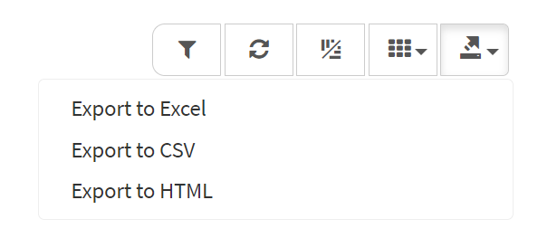
Fig. 397 Grouped export options
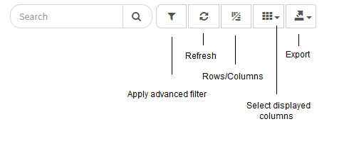
Fig. 398 View and filter options
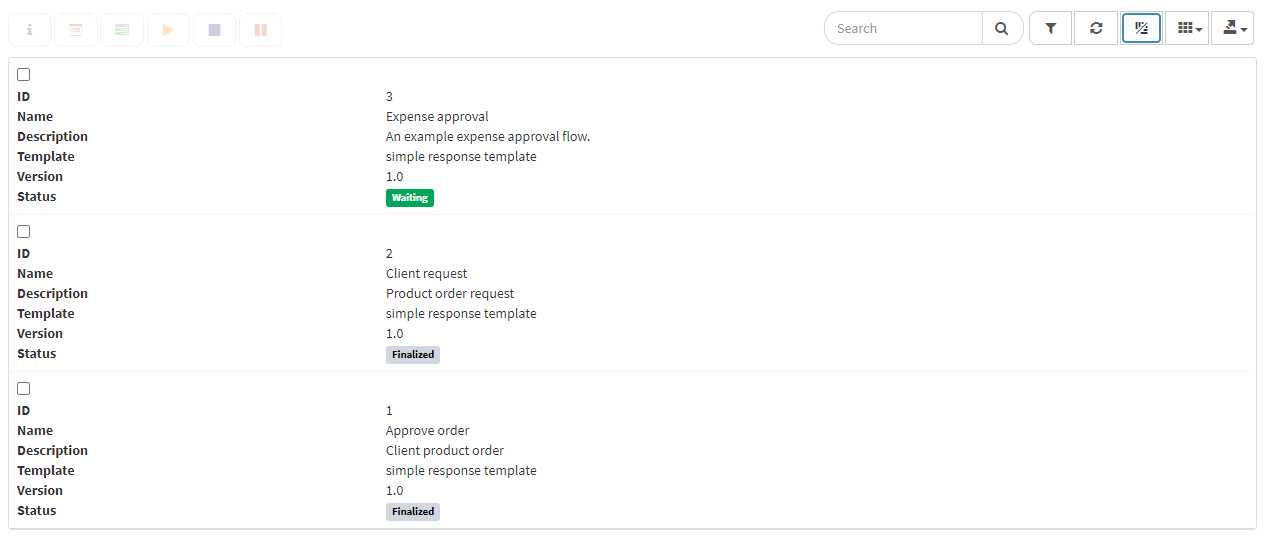
Fig. 399 View displayed with the Rows/Columns option
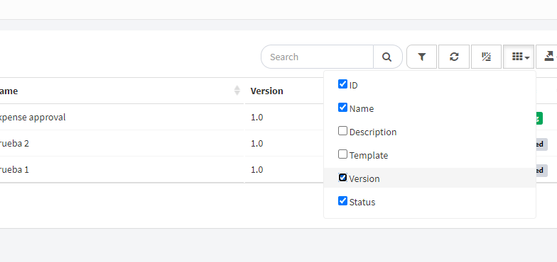
Fig. 400 “Flows” view without the “Description” column, which was unchecked
Element order in tables
If you click on the header of any column in a table, Qflow sorts the elements of the view by the values of that column. The small arrow that appears next to the column title indicates whether the view is being sorted in an ascending or descending order according to the values of the selected column.
Working with flows and tasks
This section describes how to start flows, see their data and respond to their tasks.
Flows, templates and tasks
The two main types of elements that Qflow Task works with are flows and tasks.
A flow is based on a template, which generally specifies sequences of activities, data, and how those activities are assigned to users, among other aspects of a flow. A flow is the execution of what is defined in a template, with specific data. For example, you can create a template for the expense approval process seen in the tutorial, but, although each flow will have the same structure, each one will handle different amounts, send tasks to different people, etc. To start a flow, you must indicate which template will be used.
Once a flow is started, tasks are generated for the people that take part in it. For example, in the expense approval process seen in the tutorial, some person or group of people is assigned the task of evaluating whether or not the expenditure should be approved.
This section explains how to:
Start a flow: starting a flow implies selecting the template on which the flow will be based. The template indicates what activities are included in the flow, in which order they are executed, what data it has, who should execute the tasks, and so on.
Work with tasks: a flow in progress assigns tasks to people. These people use the Qflow Task to respond to tasks. Users with special permissions can assign and reassign tasks.
Work with flows: once a flow is started, it can be executed normally, but it can also stop due to errors, delays, etc. Qflow Task allows you to check the flows’ status, retry the execution of steps that stopped due to errors, roll back a flow and other activities that allow correcting the execution of a flow when there were errors.
Start flow
To start a flow:
Click on the “Start flow” option in the sidebar menu. This makes Qflow show a screen with a view that contains the flow templates that you have permission to start. Alternatively, you can open some template view that contains the template that you want to use.
Search the template that you wish to use to start the flow. If there are many templates, you can type in the “Search” field a text with a part of the descriptive text that is shown in the screen for a template (descriptive text is formed by the template’s name, the version’s name in parenthesis and its description; see Fig. 401. The displayed templates have no description). This makes Qflow filter the list and show only the templates that contain said text.
Click on the icon that represents the template that you want to use (for example, in the circle with the letter A in the case of the first template in Fig. 401). This will take you to the flow start form. Alternatively, you can select the template by clicking on its name and then clicking on the “Start flow” icon (
 ). Fig. 402 shows a standard Qflow form.
Fill out the starting form. This includes entering the flow name, data, and possibly attaching files and selecting who will perform certain roles.
Click on “Start”. Once the flow is started, Qflow shows the flow’s form.
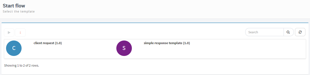
Fig. 401 Flow templates
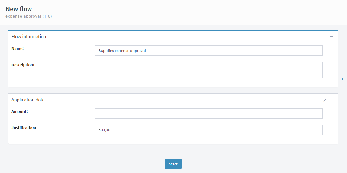
Fig. 402 Example of a flow’s standard start form
Start flows as external or anonymous users
Qflow allows flows to be started by users that are external to the system, without needing to be registered to do so. In order to allow flows to be started in this way, we must configure it explicitly on Qflow Design (see the Qflow Design manual for more details).
Flows that are started anonymously will have a “Guest” user as the flow starting user.
This feature is very useful for cases like survey processes, event invitations, work application forms, and any other situations that require people that are external to the organization to interact with the system.
Considering that Qflow displays dates based on the user’s time zone preference, and that in the case of external/anonymous start that preference is absent, the time zone in which dates are displayed is shown in in the upper right corner of the form (Fig. 403).
Note
In the OnPremise version of the product, the configuration for the captcha required to start anonymous flows is disabled by default, as it must be configured by the user in order to be used. To see how to configure it, see the installation and configuration manual.

Fig. 403 External/anonymous flow start
Work with tasks
Qflow flows tend to assign tasks to users, either directly or indirectly through work queues. A user that was assigned a task must respond to it, either by selecting an answer to a question (for example, indicating whether they approve of an action) or indicating if the task is finished. This can be done in the Qflow Task.
Also, tasks sometimes require administrative actions. For example, a task might be assigned to someone who is absent, and it is necessary to assign it to someone else because the first person cannot perform it. This is also done in the Qflow Task.
Pending tasks for a user
A user can have several tasks that await a response from them. To check your pending tasks, the most practical way is to use the “My tasks” link in the upper menu (see Qflow Task’s description). The icon of said link shows the user’s number of pending tasks. When they click on that icon, a menu is displayed with the subject of some of the pending tasks (Fig. 404). Next to each task is the status (“Normal”, in the example). In the lower part of the menu there is a link which allows access to a view that contains all of the user’s pending tasks. This view shows more information.
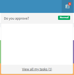
Fig. 404 Pending tasks menu
Respond to tasks
If a task is selected, either by clicking on it in the menu or in a task view, Qflow will take you to the task’s form. Said form shows the flow’s data and allows you to respond to the task.
A user can also respond to tasks that have been assigned to work queues in which they have permission to actuate (see Work queues).
Quick response
The quick response feature, which is by default configured in the ‘My tasks’ view, allows users to select one or several tasks and respond to them together (only responses in common between the selected tasks will be shown). If a task has required scope for data, roles, or attachments, or does not allow for quick response, the function will be disabled and cannot be used. If any of the selected tasks require or allow for comments, a field to enter them will be displayed. This comment will apply to all selected tasks that allow for them.

Fig. 405 Views screen
Quick response can be activated from the button on the table and from the contextual menu (by right-clicking within the table). Multiple tasks can be selected and pressing the “multiple respond” button opens a drop-down list with common responses.
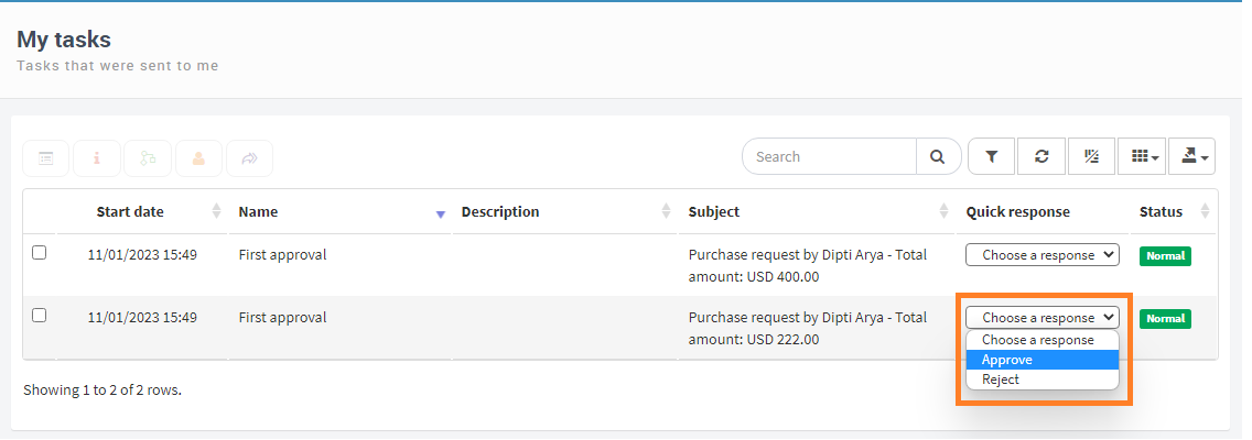
Fig. 406 Views screen
It also allows to answer from the table by selecting a response from the quick response drop-down list in “Quick response” column. Once we have responded, we will see a notification about tasks being responded in background, we can check the “Do not show this message again” option to stop receiving this notification.
Note
If the browser supports the use of Service Workers, when responding, a menu will be displayed below where the progress of the responses can be tracked. This menu allows you to filter by the current status of the tasks, whether they are completed, in progress or in error.
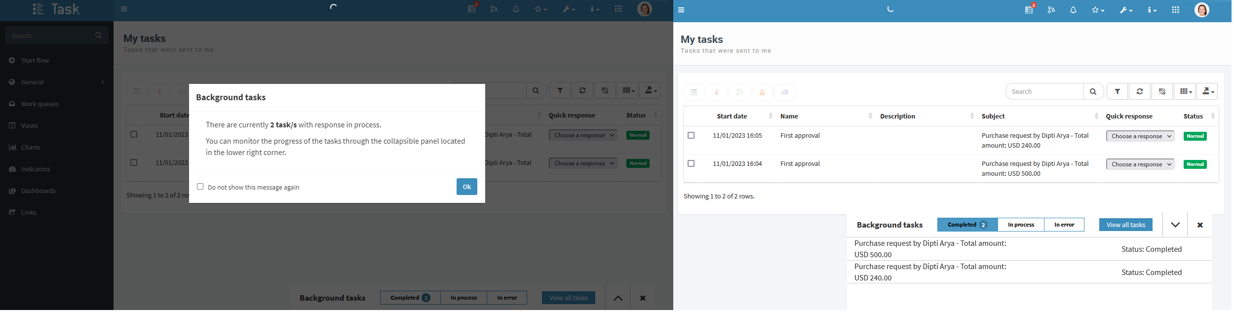
Fig. 407 Background tasks
Additionally, it can be viewed in a specific table with the information of the background tasks
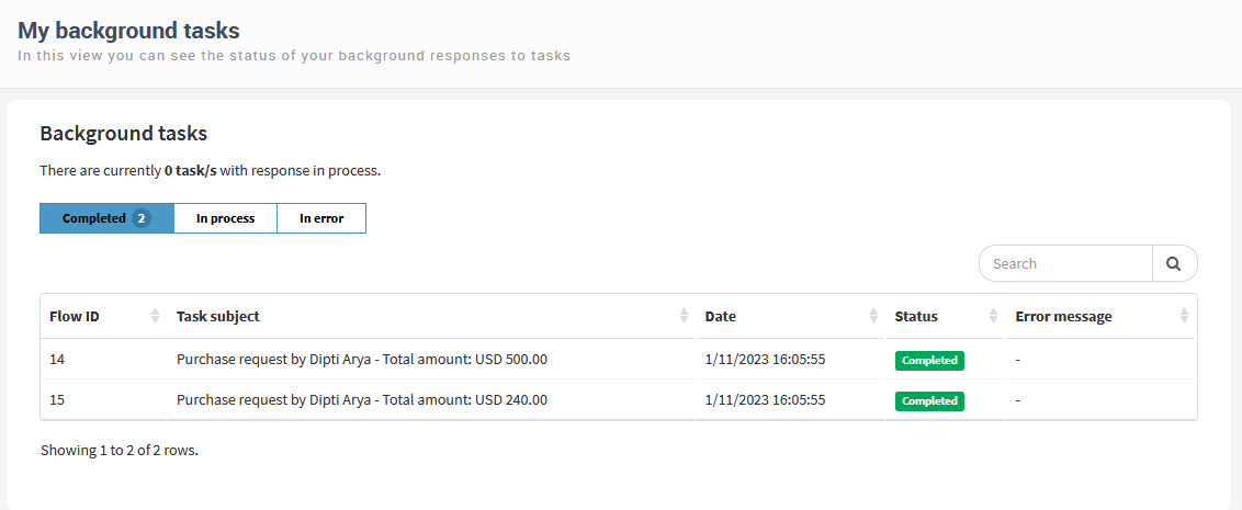
Fig. 408 Background task table
It is possible to configure custom views that use this feature. To do so, you must do the following:
Create a view of type “My tasks”.
Add the “Task quick response” column.
On the column added in the previous step, choose “Show task responses as a list for quick response” as the display format.
Save the configuration of the view
Now we have a customized view which will allow us to make quick responses to our tasks. We can use the quick response feature on any custom view, as well as the “My tasks” view, in Tableros de control.
Task response by external users
In the same way that we can configure a process so that it can be started by users external to the system, we can configure a task so that it can be responded to by external users as well.
We can assign tasks to external users by using their email address as addressees, so that when a task is dispatched, they will receive an email with an access link to the task form to be able to respond to it, without requiring to have a user in Qflow. We can configure data, parameters or directly specify the email addresses to which to send the task. Like the external/anonymous flow start, the external task response form shows the time zone that Qflow uses forr all dates and times on the page (Fig. 410).
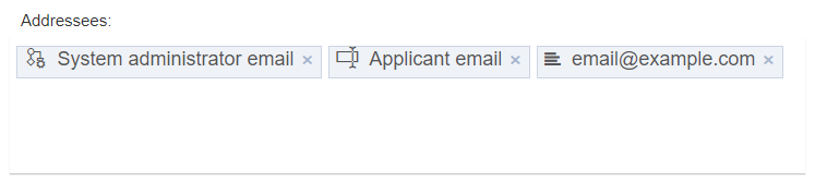
Fig. 409 Task with external addressees using data, parameters and emails.
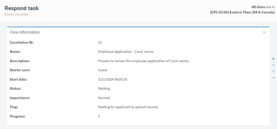
Fig. 410 External task response form
The actions of external users in their tasks are also reflected in the audits and system histories, identified by the email to which the task was sent, indicating that it is a Guest user.
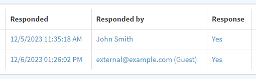
Fig. 411 Task response history with external user
As with tasks for system users, we can generate alerts, reminders, time outs and delegations for them, which will reach external users through their email. We can delegate tasks from external users to system users, but not to external users.
To configure a task to be responded to by external users, see the External task response of Qflow Design documentation.
Process start and task response confirmation messages
When designing processes, in the start event and in user tasks, we can define confirmation messages that are displayed when initiating processes or responding to the task, respectively. These are shown for both system users and external users.
These messages can be adorned with tags to include data, parameters, process information, and other elements in the confirmation message.
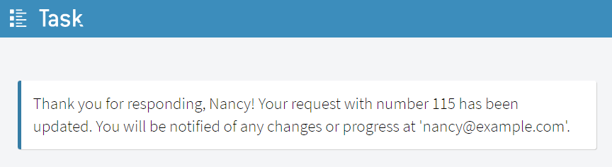
Fig. 412 Confirmation message
To configure confirmation messages for starting processes or for the response of tasks, refer to the specific settings for the start event and user task in the Qflow Design manual.
Work queues
Tasks assigned to a work queue can be responded by any user that has permission to act in that queue. As these tasks are not assigned to any specific person, they do not appear on the “My tasks” view of any user.
To check the tasks of a work queue you belong to, use the “Work queues” section in the sidebar menu. To access a screen that shows all of the work queues that you are authorized to view, click on the “Work queues” option itself. In that screen, you can access a work queue by clicking on its icon or by selecting it and then clicking on the arrow ( ). Alternatively, you can access a work queue directly from the sidebar menu: if you click on the small arrow that appears next to the “Work queues” option, work queues in which you have permission to actuate are shown in the sidebar menu itself (Fig. 414). To access one of them, click on it.
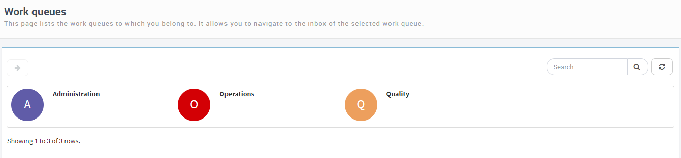
Fig. 413 Work queues screen with three work queues
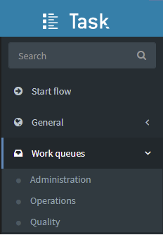
Fig. 414 “Work queues” option in the sidebar menu, expanded to show three work queues as sub options.
Work queue tasks
The work queue panel (Fig. 415) shows the inbox of that queue.
To respond to a task assigned to a work queue, a user must first take that task, so that other users cannot work on it. If the user later decides not to perform said task, they can leave it for another user to take. Thus, we can avoid two users working simultaneously on the same task. Keep in mind that if you access a task’s form to respond to it, Qflow will automatically put the task in your name.
The “Status” column indicates if a task is available to be taken and in the case of tasks taken by a user, the “Task taken by” column indicates which user has it assigned to them.
The inbox tends to have various tabs. Each one shows a different view of the queue’s tasks. What tabs are shown for any particular queue is something that may vary, given that it is something that can be configured. However, there are three views that are predefined in Qflow, which will probably appear in most cases:
Active: it shows all of the queue’s active tasks.
Taken by me: it shows only the active tasks that are taken by the user.
Filed: it shows only archived tasks.
The operations available for a work queue’s task are the following:
Archive: it temporarily archives a task, so that it stops being active and appears in the list of archived tasks. The task can be reactivated later. This option is only available for active tasks.
Assign: it allows you to assign the task to a user. When you assign a task to a user, the task is set to them. For a user to be able to assign a task to another user, they must be a supervisor of the node to which that user belongs (see the Qflow Team manual). Additionally, the user that is assigned the task must have permission to actuate on the work queue.
Respond: it takes you to the screen that allows you to respond to the task. If the task is not taken by the user, it will be assigned automatically when they complete it.
Leave: it allows you to leave a task that had been taken.
Restore: it allows you to reactivate an archived task.
Take: it allows the user to take the task to actuate on it. If a user is a supervisor of the work queue, they can take a task that is already taken by another user, that is, take it from the other and take it for themselves.
All of these operations are available in the work queue view’s context menu, as well as in the icons that appear in the upper part.
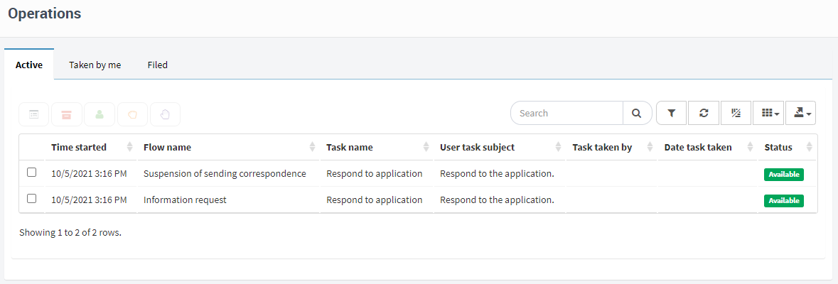
Fig. 415 Work queue view, with two tasks
Reassigning tasks
If a user has a task assigned, but cannot respond it (for example, because they are absent), it may be necessary to reassign the task to someone else. It can also happen that a user from a work queue is absent and has taken a task, so it is necessary to take the task from them so that another user may respond to it. In the latter case, the “Take” (a supervisor of the work queue can take the task for themselves) and “Assign” (Work queue tasks) operations can be used (see View creation).
In the case of a task assigned directly to a user, the task can be delegated. This operation removes the task from all its recipients and assigns it to another set of recipients. Another operation, “Delegate task to”, allows you to remove the task from only one of the recipients of the task and assign it to another, keeping the rest of the recipients. This operation is available when viewing the details of a task (where the recipients are listed separately) and in individual task views (“Tasks to”; “View creation”).
To delegate a task, search for it in some task view (for example, the one that appears in the “Tasks” option in the sidebar menu) and select the “Delegate task” option (for example, by right clicking in the context menu and then “Delegate task”). This takes you to the delegate task screen (Fig. 416), where you can modify the task subject. The “Delegate task to” operation shows a very similar screen, but without the “Delegate roles” option, which makes no sense in this case.
To select addressees, start typing in the “Addressees” field the name of a user that you wish to assign the task to. Qflow will show a menu with the users whose names contain the text that was written. Select the desired user and repeat the process if you wish to add more users.
A user has the ability to delegate tasks to themselves or to the users they supervise. They can also delegate tasks to work queues where they have permission to “Actuate”.Additionally, if they have the “Delegate task” permission in Qflow Task, they can delegate tasks currently assigned to users who do not have them as a supervisor. However, the final recipient of the task must always be the user themselves, one of their subordinates or one of their work queues.
The “Delegate roles” option causes the flow roles to be modified. Example: suppose that the task that is being reassigned is assigned to the “Evaluator” role. The user John Doe is the user assigned to that role; thus, he is the addressee of said task. When you delegate the task without checking the “Delegate roles” option, the task is reassigned to another user (for example, Jane Smith), but John Doe is still in the “Evaluator” role. If further ahead in the process there is another task assigned to the “Evaluator” role, this task will be assigned to John Doe, because he is still in the “Evaluator” role. If, on the contrary, the “Delegate roles” option is checked, not only is the task being delegated reassigned, but the “Evaluator” role is modified in such a way that Jane Smith can now perform it. In this way, all the tasks assigned to the “Evaluator” role will no longer be assigned to John Doe, but will instead be assigned to Jane Smith.
Once you have added all the addressees that you want to delegate the task to to the list, click “Delegate”. Qflow will send them a message indicating that the task has been assigned to them.
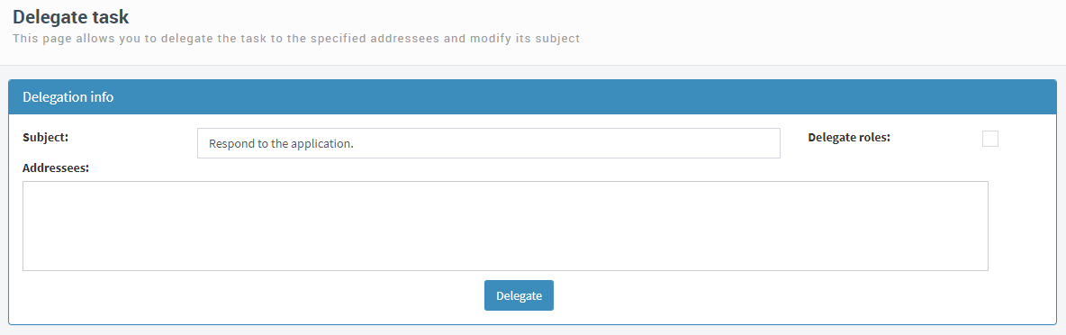
Fig. 416 Delegate task
Forwarding messages, sending alerts and reminders
Qflow allows sending alerts and reminders to the addressees of tasks. To send an alert or reminder, go to the detail page of a task and select the “Send alerts” or “Send reminders” actions. You can also do this in a view of individual tasks (“Task to” type views), which show a row for each addressee of a task (instead of a row for each task, as in task views).
You can also resend the message that informs a user that they have a pending task by using the “Resend mail” action, available in the same way.
Work with flows
Flow’s basic tracking is done through the flow views on Qflow Task. This section explains how to use those views, which allow you to check the status of each flow and to solve problems that may occur during their execution, for example when a flow stops due to an error.
Flow data and operations
Through the flow views you can access information about the flows and execute operations on them, for example, resuming the execution of a flow that stopped in an error or ending a flow by force. Flow views are shown as tables and work as described in General user interface operation, where how to access the available operations and how they work is explained. The available operations are the following:
View details: it allows you to see detailed flow data, like its application data (data that the flow uses and can modify), users that participate, the design and which step it is currently in, etc. From this screen you can perform administrative actions. This screen is described in detail further below (see Flow details).
View flow: it allows you to see the flow’s form. If it is a standard form, this shows basic flow data, such as which template it is based on, when was it started, etc. If it is a custom form, what is shown can vary.
View active tasks: it allows you to view the list of tasks that are awaiting a response, with information about who the addressees are. There can be more than one, because a flow can have branches that are executed in parallel. This screen is described further down (see View active tasks).
Resume: if the flow was paused, it allows you to resume its execution.
End: it allows you to administratively finish the flow, meaning, make its execution come to an end without it reaching a final step.
Pause: it allows you to temporarily stop the flow’s execution.
Flow details
The figure shows the flow details page. It is divided in the following tabs:
General
Design
Tracking
Threads
Detail
History
General
The “General” tab (Fig. 417) shows the flow’s basic data. What is shown in this tab is very similar to what is shown in the flow form, when this is a standard form (non custom). Two groups of data are shown: flow information and the flow’s template information.

Fig. 417 Flow details/General
Most of the data that is shown does not require any explanation. The rest of it is explained next:
Status: it indicates the status flow status. It can be:
Active: the flow is being executed.
Paused: the flow was paused by the “Pause” action.
Finished: the flow finished its execution naturally (it reached an end step).
Finalized by user: the flow was terminated by a user (it was terminated by force, without having reached an end step).
Waiting: the flow is waiting for one or more users to respond to pending tasks. A flow that is waiting is active (if a filter is applied to a view, indicating that only active flows must be displayed, flows that are waiting will be included in the view).
On error: the flow is stopped because there was an error in its execution.
Flag: the flag is an informative text that can change each time a flow arrives at or moves from a step. It works like a tag that provides information about the flow’s situation. For example, the designer of an expenses approval flow that contains a task called “Manager approval” can specify that when the flow reaches that task, the flag changes to the text “Waiting for manager approval”. When someone sees the flow in Qflow Task, they can quickly know what its situation is without needing to, for example, open the details screen.
Progress: it indicates the flow’s advance percentage. Like the flag, the flow’s progress percentage is not calculated by Qflow, instead the flow’s designers are the ones who determine what a flow’s advance percentage is when it reaches a certain step. Thus, this property will make sense or not, depending on how it is used. There can be flows that never get past a 0% progress percentage because their designers did not specify how that percentage should vary.
Design
The design tab shows the diagram that represents the flow process. This diagram is similar to the template diagram, but it shows with different colors which steps have been already executed, which steps are being executed, which steps remain to be executed, and which steps are stopped due to an error.
Gray: the step was never executed.
Green: the step has already been executed.
Yellow: the step is running or waiting.
Red: there was an error in that step and the flow is stopped due to that error.
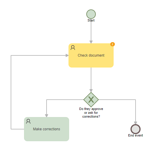
Fig. 418 Flow design: the flow went through the “Check document” step twice.
A template step can be executed more than once in a flow if the flow has a loop (a step’s next step is a step that has already been executed). When this happens, Qflow indicates it in the diagram with a number that appears over the step (see Fig. 418). This number is displayed only if the same flow step was executed more than once, and it indicates how many times that step was executed. When you place the cursor over the step’s number of executions, bubbles indicating the execution numbers will be displayed. Clicking on any of the executions will show its details.
Tracking
The tracking tab shows information about the steps executed up to the moment of opening the tab, or that are being executed (Fig. 419). For every step the execution start date is shown and for those that have already ended, their execution end date is also shown. By default, only interactive steps (questions, tasks, notifications), milestones and, if the flow naturally ended its execution, the end step are shown. For Qflow to show other steps, check the “Full view” option.
By clicking on the “+” symbol of interactive steps you can see additional information (addressee, if it was responded, what was the response, progress, alerts and reminders, etc).
If the user has “Manage flows” permissions on the package, they will have the option to “Step back to step” (“ ”), where Qflow will calculate and execute the step back that requires the lowest number of steps to backtrack to the selected step. This action alters the flow and it could reset its data, so caution is advised when using it.
If stages are defined for the flow, the tab also includes two charts: “Flow tracking” (Fig. 420) and “Flow tracking by stage” (Fig. 421). The first one shows the flow’s performance related to the sum of times defined for the current stage and those that have already elapsed. The second one details the resulting performance stage by stage. When you click on any of the stages, the list of executed steps shows only the steps that belong to that stage.
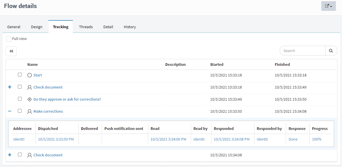
Fig. 419 Tracking
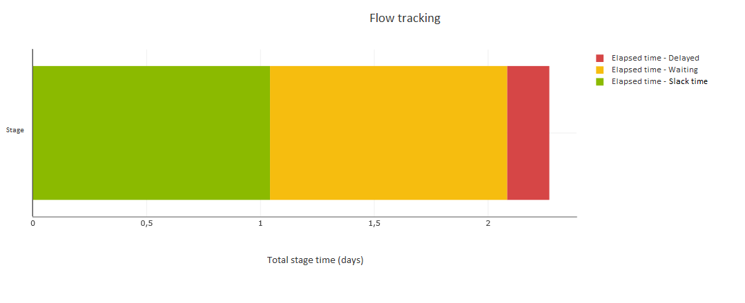
Fig. 420 Flow tracking
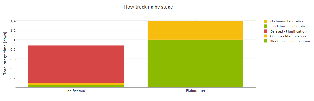
Fig. 421 Flow tracking by stage
Threads
The “Threads” tab (Fig. 422) shows the threads, i.e., flow branches (step sequences) that are executed simultaneously. A flow has at least one thread, but it can have more if there is a separation step, as this can make several steps be completed in parallel. In this case, the flow is divided in threads (Fig. 423). When a thread is divided into several threads, these are said to be children of that thread.
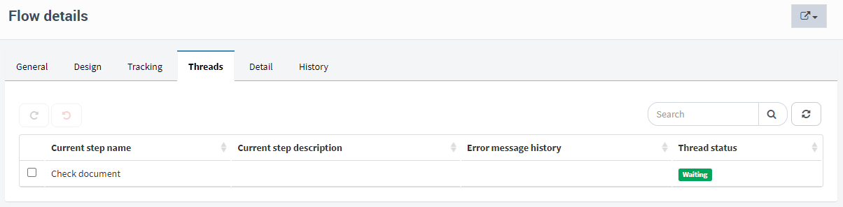
Fig. 422 Flow threads
For each thread, its current status is displayed. For threads in some states (see below), the flow can be made to step back, as if the execution of some steps was undone (although without altering the data). Threads in error states can be executed again to try to recover them (for example, if the cause of the error has been eliminated). The possible thread states are:
Running: the thread is being executed. It is uncommon to see a thread in this state, given that threads advance very quickly when they are in this state and most of the time they are waiting, but a thread can be in this state, for example, if a code step is being executed.
Waiting: the thread is waiting for the occurrence of an event, usually a user’s response. It is possible to retry the execution of the current step of a waiting thread. To do this, click on the “Retry execution” button. It is also possible to make the thread return to a step previous to the current one, by clicking on the “Step back” button. A thread can only step back to a starting, separation or union step.
Error: the thread is stopped due to an error. Any error that happened in the thread is displayed in the “Error message history” column. It is possible to retry the execution of the current step of a thread in error. To do this, click on the “Retry execution” button. It is also possible to make the thread return to step previous to the current one, by clicking on the “Step back” button. A thread can only step back to a starting, separation or union step.
Separation: the thread was separated in various threads and it is waiting for those threads to join again in a union step. A thread can only be in this state if the current step is a separation step.
Paused: the thread was paused.
Finished: the thread finished its execution. A thread can be in this state even if it is still waiting for its children threads.
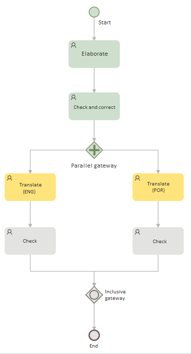
Fig. 423 Flow design with two threads being executed
Detail
Like the “General” tab, the “Detail” tab shows the flow’s basic information, but it also shows application data, roles, attached files and the comment log. It does not allow you to modify them, something that you can do in the flow’s edit form.
Of the application data, various properties are shown (name, description, value, etc). In the same way as a view, you can decide to hide some of the columns that represent these properties. If a datum is multivalued, its values are shown one next to the other, separated by a semicolon (“;”). Data can be displayed in groups. This is useful for information that belongs to the same group or line block (Fig. 425).
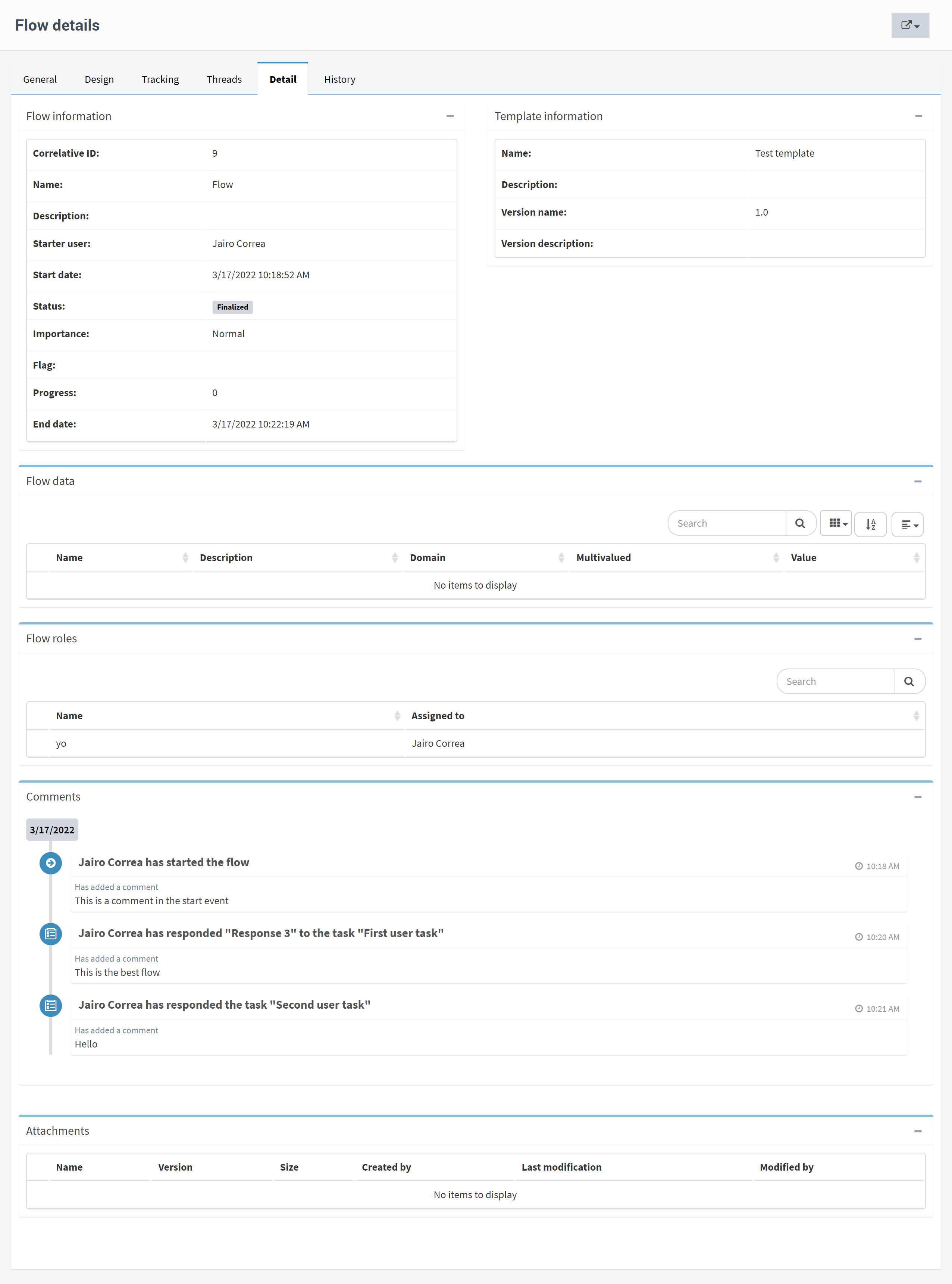
Fig. 424 Detail
If a datum has been modified, you can click on the button with the “+” symbol and display the datum’s modification history. For each change, the step in which the datum was changed (e.g., in a task), the previous value (“Last value”), the value assigned to it (“Value”) and the date of the change are indicated. In addition to this, the type of action and the user responsible for it, if applicable, are displayed. The actions recorded are: start flow, edit flow, save data in task, respond to task, rollback, retry execution, step execution (non-interactive), delegation and bot step execution.
The role history, comments and attachments can be viewed in a similar manner.
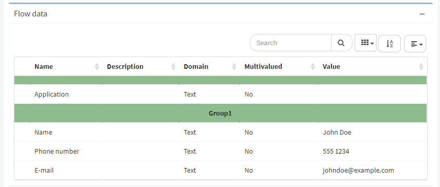
Fig. 425 Three pieces of data from the “Contacts” block are displayed grouped together. “Application” does not belong to the block.
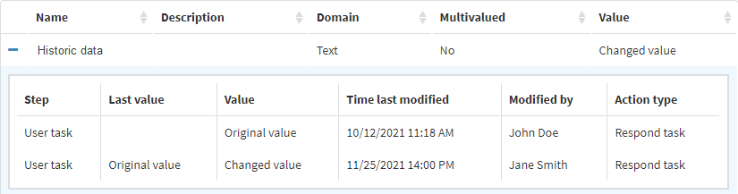
Fig. 426 “Historic data” was modified twice.
History
The history tab, which is shown only if the user has permission to audit in the package, shows the operations executed on a flow, who performed them and in which date, among other information. For example, if applicable, the name of the step on which the operation was performed is shown. Taking or leaving a task from a work queue are also actions that are shown in the history.
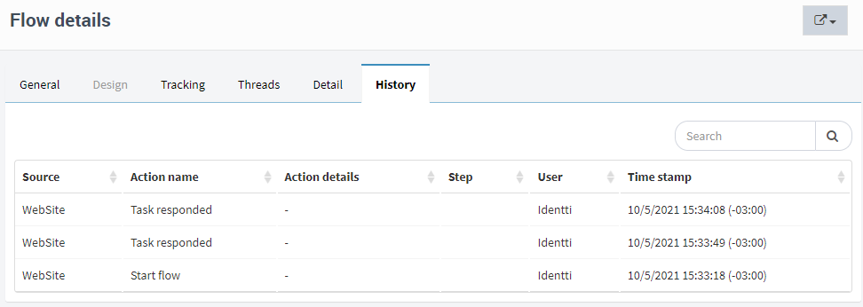
Fig. 427 History
View active tasks
The active tasks page shows information about the flow’s pending tasks.
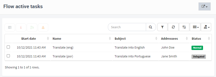
Fig. 428 Active tasks
See the Work with tasks section for information about how to work with tasks.
Flow monitoring and analysis tools
This section describes some elements that facilitate the monitoring of flows, as well as organizing their information. These elements are:
Views: a view is the definition of a set of elements (e.g., a set of flows or tasks), including the order in which they are displayed, which columns are shown and which elements are shown (e.g., only the tasks directed to a specific work queue).
Charts: Qflow allows you to define charts to visualize flow data.
Indicators: indicators are numbers that are calculated with the flow data, and are shown with some graphical support that allows for a quicker understanding of their meaning. For example, an indicator can be represented with the image of a thermometer, with colors that vary depending on the number’s value (red for something serious, green when it is fine, etc).
Dashboards: a dashboard is a page that shows views, charts and indicators. Qflow allows you to create dashboards to bring together on the same page views, charts and indicators that are related or that allow you to perform some monitoring and control task.
Views
A view is the result of applying a filter to a set of elements, for example, flows. Given a set of elements and a set of criteria that allows us to distinguish elements from each other, a view is the subset to which those elements belong. For example, a criterion to make a flow view could be that the flows on that view are those that were started on a particular date.
Much of what is shown in Qflow Task is a view.
General: the sub options of the “General” option in the sidebar menu are views:
Flows: flows view.
Tasks: tasks view.
Notifications: notifications view.
My tasks: tasks view that shows only the current user’s tasks.
My flows: flows view that shows only flows that were started by the current user.
My notifications: notifications view that shows only notifications sent to the current user.
Work queues also use views.
These views, which come predefined with Qflow, are system views. Qflow allows you to create other, customized views, to facilitate the information’s organization. When you create a view, you can choose whether it will be displayed in the sidebar menu or not. Views that are included in the sidebar menu are shown as sub options of that menu’s “Views” option. The other views are accessible from the views screen (Fig. 429), which you can access through clicking the “Views” option.
This screen is also helpful for creating and modifying views. It also allows you to export and import them, so that you can define a view in one environment (for example, in a development or test environment) and then export its definition to import it into another environment (for example, a production environment).
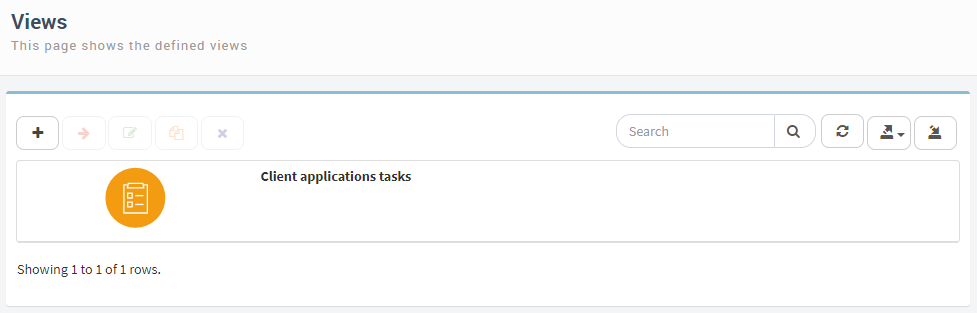
Fig. 429 Views screen
View creation
A view can be created from scratch, or an existing view can be copied.
To create a view, click on the “Views” option in the sidebar menu to access the views screen (Fig. 429). Once there, click on the copy view icon ( ) or on the add view icon (+). If you click on copy view, Qflow directly shows the view definition screen (see View definition).
If you click on the add view icon, Qflow will take you to a screen like the one seen in Fig. 430.
In this screen you must define:
Package to which the view will belong: a view belongs to a certain package, in the same way as flow templates. The package to which a view belongs is important because it determines many of the permissions that are applied to the view. For example, whether a user can modify a view depends on if they have the “Manage views” permission for the package that contains that view. It also defines which columns will be available in the view (for example, what application data, given that it also has a place in the packages structure; see the Qflow Design manual for more information).
View type: the view type indicates the item type that the view contains. A view can contain public or private items, and in each of these categories there are several types of views. These types indicate which types of elements (templates, flows, tasks, etc.) are shown in the views.
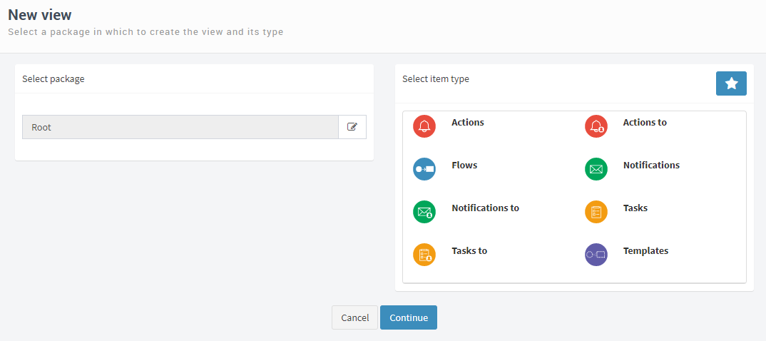
Fig. 430 First step to create a view
To select the package:
Click on the icon that appears next to the root package name, as is shown in Fig. 431. This displays the package tree and changes the icon you clicked on to a confirmation button (Fig. 432).
Click on a package to select it. This will change the name that appears next to the icon you clicked to open the tree (Fig. 431).
Click on the confirmation button (
 ). This closes the package tree.

Fig. 431 First step to select a package
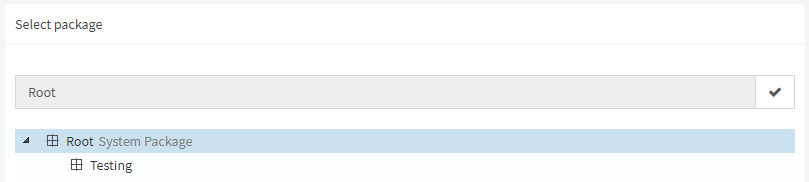
Fig. 432 Package tree open, ready to select one.
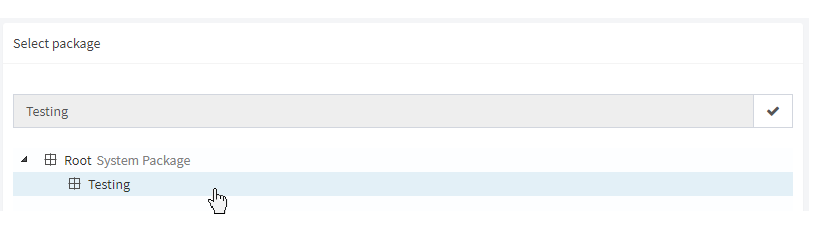
Fig. 433 Testing package selection
To select the type of view, use the box that appears in the right part of the screen (Fig. 434). There are two view types categories: public item views and personal item views. Initially, only the public item views are shown. The star icon allows you to change the screen to show personal item views and vice versa.
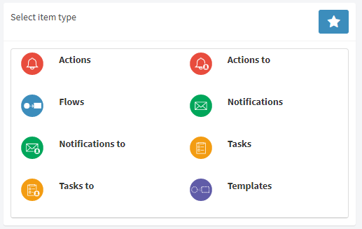
Fig. 434 Box to select the type of view. In the upper right corner, the star icon to swap between the views with public items and views with personal items is shown.
The view types are described next:
Public item views: in principle any user can view them, unless permissions have been defined that restrict access to them. Public views can be of the following types:
Actions: views that display time control actions (reminders, alerts, delegations, and deadlines). For example, if a task is delayed, Qflow can send an alert to a set of users. In Qflow Task, you can access that alert through an actions view.
Actions to: views that show individual actions. An action is composed of various individual actions. For example, if an alert is sent to a set of users, such as the users of a node, that alert is an action that is composed of several individual actions (“actions to”), one for each of the users of the node. Simply put, these views show one item for each recipient of the action, while action views show one item per action, regardless of the number of addressees it has.
Notifications: views that show notifications. The “Notifications” sub option of the “General” option in the side menu is an example of a view of this type.
Notifications to: views that show individual notifications (the view shows an element for each addressee of the notification).
Flow templates: views that show flow templates. These views can be used to start flows.
Flows: views that show flows. From these views you can view the flow’s data, their charts, in which step they are, etc. The “Flows” sub option of the “General” option in the sidebar menu is an example of a view of this type.
Tasks: views that show tasks. The “Tasks” sub option of the “General” option in the sidebar menu is an example of a view of this type.
Tasks to: views that show individual tasks. A task is composed of several individual tasks, one for each addressee of the task. These views show an element for each addressee of a task.
Personal item views: personal item views reference a particular user and can only be seen by that user. A typical example is “My tasks”, which shows the current user’s tasks. Personal views can be of the following types:
My actions: it shows individual actions (“actions to”) whose addressee is the current user.
My notifications: it shows individual notifications whose addressee is the current user
My flow templates: it shows flow templates whose owner is the current user (the owner of a template is specified in the Qflow Design).
My flows: it shows flows started by the current user. The “My flows” views, which appears in the upper menu, is a view of this type.
My tasks: it shows individual tasks (“tasks to”) whose addressee is the current user.
My responded tasks: it shows tasks that have been responded by the current user.
Once the package and view type have been selected, click on the “Continue” button. This will take you to the view definition screen.
View definition
The view definition screen has the following sections:
Details
Columns
Sort
Filters
Parameters
Permissions
When you have finished modifying the properties of each of these sections, you must click on “Done”. Qflow will validate the data and if there are errors, it will warn you. If you click on the error warning, Qflow takes you to the part of the screen where you can correct the error.
Next, the properties of each section of the view definition screen are explained.
Details
The details section shows the package and view type, and it allows you to choose values for the following properties:
Name: the view’s name. This is the name that is shown in the view list.
Description: the view’s description. It is the description that appears under the view’s name.
Highlight view (show view in the navigation tree): if this option is checked, Qflow shows the view in the navigation tree.
Page size: it indicates how many elements will be shown in each view page. When a view is shown, not all elements are displayed at once, instead, pages are used to show a limited number of elements.
Pages number to display: when a view’s page is displayed, it also shows buttons to go to the first, previous, next and last pages. The numbers of the pages previous and next to the current one are also shown. This parameter indicates how many of these numbers will be displayed.
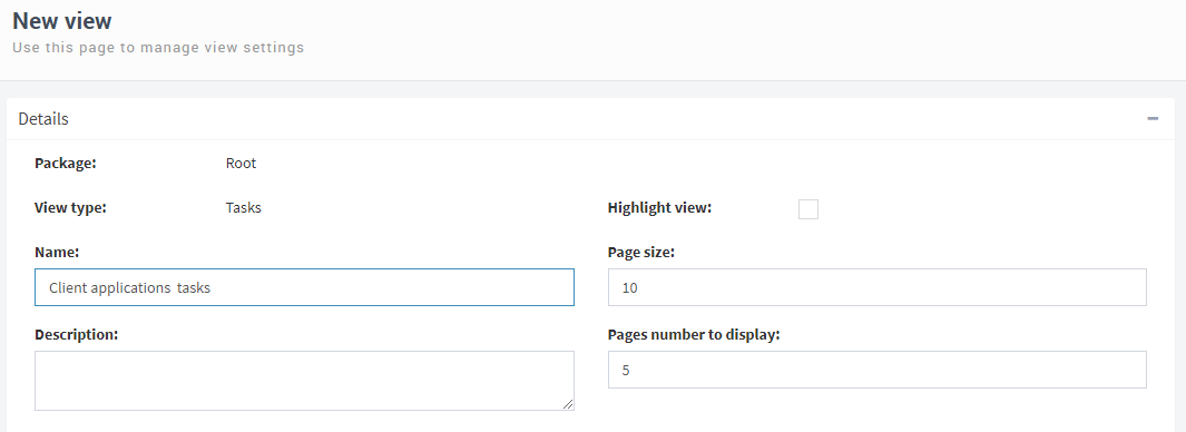
Fig. 435 View definition: Details
Columns
Views are shown as tables. The columns section allows you to specify which columns will be in the table that represents a view. Each type of view has a set of columns that are initially included when creating a new view, but these can be removed and others can be added.
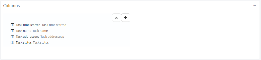
Fig. 436 View definition: Columns
To delete a column or modify its properties, select it. With the column selected, Qflow shows its properties and enables the button that allows you to delete it (see Fig. 437).
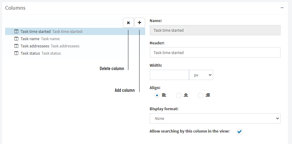
Fig. 437 Columns configuration section
The properties of a column are the following:
Name: it cannot be modified. It corresponds to the type of column. The type of column is selected when you add the column (see below).
Header: it is the title that will be shown for that column when the view is displayed.
Width: column width, either in number of pixels (px) or in percentage (%).
Alignment: column alignment (left, center, right).
Display format: type of format to apply over the content of the column (see below).
Allow searching by this column in the view: if this option is checked, the values of this column will be considered to filter results when using the search field on the upper part of the view. Some columns, like those that show “Hour” type data, do not allow to be searched by their values.
To add a column to the view, click on the plus icon (“ ”). This displays a box in the upper part of the column section that shows a list with the available columns (Fig. 438). The columns are grouped into categories (“System columns”, “Application data”, “Template roles” in the figure). To add one of them to the view, double click it, or click it and drag it down, to the “Drop here” area. Alternatively, you can select one by clicking on it, and then clicking on the plus icon that appears in the header of the column list.
To change the column order, click on a column and drag it to the place you want it to be. For example, if you wish for the column “Task addressees” to be further left than the “Task time started” column, drag it until it is above the latter.

Fig. 438 Add a column
The display format defines how the column will be shown in the view. By default, there are nine options:
None.
Show as link.
Show uppercase text.
Show first letter in uppercase.
Show as link to the document.
Show percentage (0-100) as progress bar.
Show task responses as a list for quick response.
Show the current status of the process stage.
Show the current status of the task.
Fig. 439 shows an example of a view with the “Show as link” format.
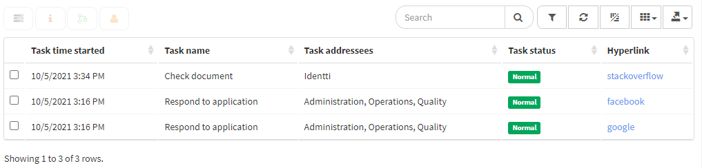
Fig. 439 Example of a view with the link format in its last column
It is possible to add new format functions in the ScriptsViewsColumnFormatters.js file inside the Qflow Task’s folder, which has a dictionary format. This process is simple if you follow the functions that already exist as an example.
Two important considerations are that the new function name must have the “Formatter” suffix and that descriptive texts must be added in the “resources” key of the dictionary with the text to show in the column’s options. The available languages are Spanish, English and Portuguese, allowing you to add text for each.
Sort
The sort section (Fig. 440) allows you to specify the order in which the view elements must be shown. In the same way as with the columns, when a view is created a sorting criterion is included by default, depending on the type of view (for example, for tasks views, the default sorting criterion is the task’s start date).
In order to delete or modify a sorting criterion, select it by clicking on it. This enables the delete button and displays the criterion’s properties. These are:
Column name: it cannot be modified. It indicates which column is used to sort. It corresponds to the type of column, which is selected when you add the column (see below).
Direction:
Ascending (ascending order; for example, A to Z).
Descending (descending order; for example, Z to A).
The procedure to add a sorting criterion is similar to the procedure to add a column: click on the plus icon that appears next to the delete button. This displays the list of available columns to sort the view: drag the desired one to the “Drop here” area, or select it and click on the plus icon that appears on top of the list.
If several sorting criteria are present, these are applied in order. To change the criteria order, select one and drag it to where you want it to be.
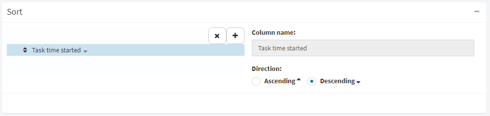
Fig. 440 Sort
Filters
The filter section allows you to specify which properties an item must have in order to be included in the view. For example, someone could want to create a view that shows only the flow tasks of the “Client applications” template. In that case, the filter would have a single condition, which would be defined by the “Template name” column and the “Client applications” value. That is: the condition for an element to belong to the view would be to have the value “Customer requests” in the “Template name” column.
Complex filters
The previous example is very simple, but Qflow allows you to create complex filter condition combinations. View filters can specify conditions for various columns and in varied combinations.
Conditions are combined with “And” and “Or” operators to indicate whether they must be fulfilled simultaneously (“And”) or whether it is sufficient for one of them to be fulfilled (“Or”) for the filter to include an element in the view. For example, the tasks view of “Client application” flows that were started from the year 2016 onwards would have two conditions combined by an “And” condition. If the “Or” condition were to be used, any flow started from 2016 would appear in the view even if it did not belong to the “Client application” template and any flow from that template would appear in the view even if it had been started before 2016.
When you wish to mix conditions with both operators, you must use condition groups. A group has several conditions, all united by the same operator. For example, to create a view of the flows of “Client applications” and “Expense approval” templates that have been started from 2016, you must use three conditions that use both operators. The combination of conditions could be represented like this:
(Template name = “Client applications” Or Template name = “Expense approval) And Start date >= 1/1/2016
The parentheses indicate that the “Or” operator must be applied before the “And” operator: what is in brackets is taken as a single condition, which must be fulfilled simultaneously with the “Start date >= 1/1/2016” condition. Without the parentheses, someone could interpret that the view includes the “Expense approval” flows starting from 2016, in addition to all “Client application” flows, independent of their date.
In Qflow, the function performed in the example by the parentheses is fulfilled by condition groups. A condition group has various conditions combined with an operator. To build the expression in the example with groups, all that is between the parentheses would be put in a group that uses the “Or” operator, and would be combined with the “And” operator with the “Start date >= 1/1/2016” condition.
Another way to understand groups is to consider Fig. 441. In the figure, a condition is a rectangular tree node. A group is a tree branch. In this case, there is only one group whose root is represented by a circle.
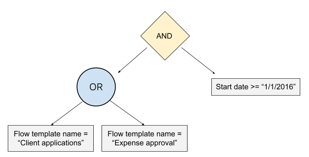
Fig. 441 Combination of filters with condition groups
How to define filters
To define filters, add the columns that you want to use in the same way that you add columns to the view (see Columns): clicking on the “” button and dragging the desired columns to the “Drop here” area.
To add a condition, click on “+Condition”. To add a group, click on “+Group”.
To the left of each condition is the operator that is used to combine it with the other conditions at the same level (the ones that are in the same group, or the ones that are outside of any group next to the one that is being modified). The “All” button is useful to select the “And” operator for all conditions at the same level. The “Some” is used to select the “Or” operator. The button with the arrows pointing in four different directions allows you to move a group or a condition. This can be used, for example, to move a condition from one group to another.
For example, to define the filters of a view that must only show flows of the “Client applications” and “Expense approval” templates that have been started from the year 2016, proceed in the following way:
Click on the “+Group” icon to add a group. This creates a group with an empty condition, as shown in Fig. 442.
Click on the “
” icon. Qflow shows the available columns to add to the filters (Fig. 443).Drag the “Template name” column to the group that was created (Fig. 444).
The group now has two conditions, but for the first one there is no column selected. Select, in the first condition, the “Template name” column, which is now a selectable option in the condition’s drop-down list.
In the first condition, next to where it says “equals”, write the name of the first template that you wish to include in the filter: “Client applications”.
In the second one, write in the corresponding place, “Expense approval”, which is the name of the second template.
Click on the “Some” button of the group. For now, the result should be as the one shown in Fig. 445. The starting date condition still needs to be added.
Add the “Flow start date” column. This will add a condition to the group that uses the “Flow start date” column, but what is desired is for this condition to be outside of the group (Fig. 446).
Drag the condition out of the group, holding the mouse button down while the cursor is over the icon with the four arrows that appears in the condition. Move the mouse up, until the condition is over the “All” and “Some” buttons that are outside of the group. Release the mouse button. The result should be the one in Fig. 447. If the condition stays inside the group, try again, remember that you must release the mouse button outside of the group.
Modify that condition for the operator to be “greater or equal” and the date 1/1/2016 and the filters will be ready.
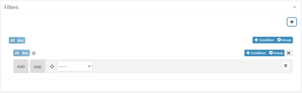
Fig. 442 A group that was just created
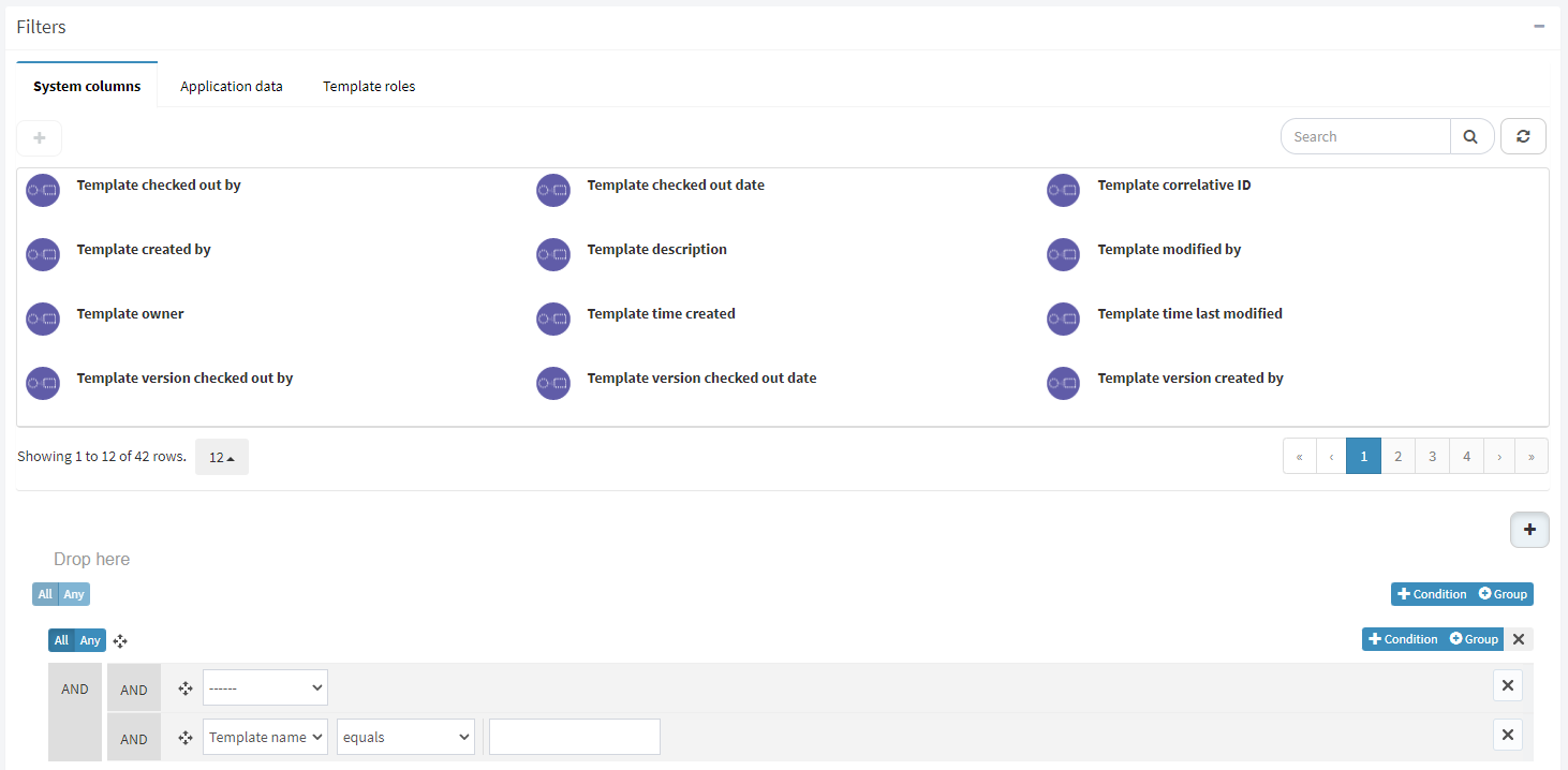
Fig. 443 The “Template name” column has just been created
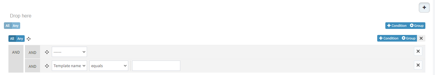
Fig. 444 Both conditions of the group use the “Template name” column
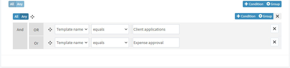
Fig. 445 Two conditions inside of a group
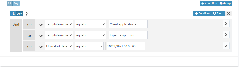
Fig. 446 The group now has three conditions, but one must be moved outside
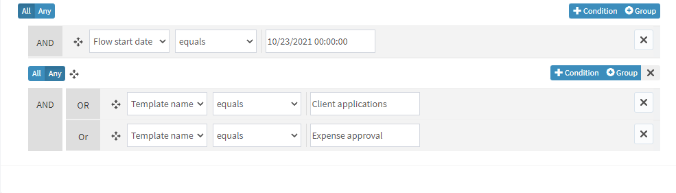
Fig. 447 Result of moving the condition outside
Parameters
In the parameters selection, you can define filter conditions that, instead of comparing the value of a column with a fixed value, compare it to a value that the user enters when accessing the view.
To add a parameter:
Click on the “+” button. This makes Qflow show the columns that are available to use in the new parameter.
Drag the column that you want to the “Drop here” area. This adds the column to the list of columns.
Once the column has been added, click on it to edit its properties. The properties are:
Column name: it cannot be modified. It is taken from the selected column.
Name: the parameter’s name. It is the name that the user will see when entering a value for the parameter.
Operator: the operator that will be used to compare the value of the selected column with the value that the user enters for the parameter.
Required: it indicates if the user is obligated to enter a value for the parameter to access the view.
When a view has several parameters, all conditions must be met for an element to appear in the view.
Permissions
The permissions section allows you to restrict the set of people that can see a view. This will only be available for public item views. Personal item views can only be seen by the user that created them, as such, it makes no sense to define permissions for them.
To restrict the access to a view:
Check the “Restrict access” option.
In the “Access allowed to” group, enter the members that you wish to allow to see the view (Fig. 448). To do this, write in the part that says “Start typing a role”, part of the name of the Qflow member to whom you wish to grant permission (the member can be a role, group, user, node or a Qflow work queue, see Permission management). Qflow will show members whose names include the typed text. Click on the member that you wish to add to select it. This will add it to the list. To remove it, click on the X button that appears to the right of the name.
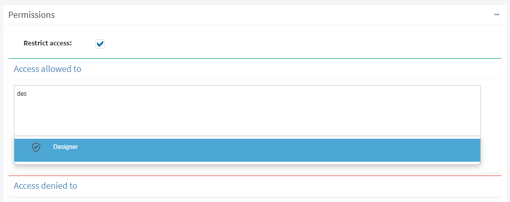
Fig. 448 Restrict a view’s access permissions to the “Designer” role
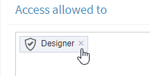
Fig. 449 The “Designer” role in a view’s list of allowed access
Import and export views
In the views screen, in the upper part, there are two buttons that allow you to export views to a file that can be imported into another environment in which Qflow is installed (for example, to export them from a development environment to a test or production environment).
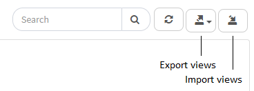
Fig. 450 Views screen with options to export and import views.
When you click on the export button, a menu appears with two options:
Export all: it exports all of the views.
Export selection: it exports the selected views.
If there is no view selected, only the “Export all” option is shown.
When you click on any of the two options a file will be downloaded which contains the view’s definition that can be imported in another environment.
To import a views file, click on the import button. Then you can select the file that you wish to import.
Charts
Qflow allows you to create charts of various types to facilitate the visualization of flow data. As with the views, for each chart you can define whether it will be displayed in the sidebar menu or not. Charts that are included in the sidebar menu are displayed as sub-options of the “Charts” option in that menu. The other charts are accessible from the charts screen, which is accessed by clicking on the “Graphs” option. This screen (Fig. 451) is also used to create and modify charts. In addition to this, it allows you to export and import chart definitions.
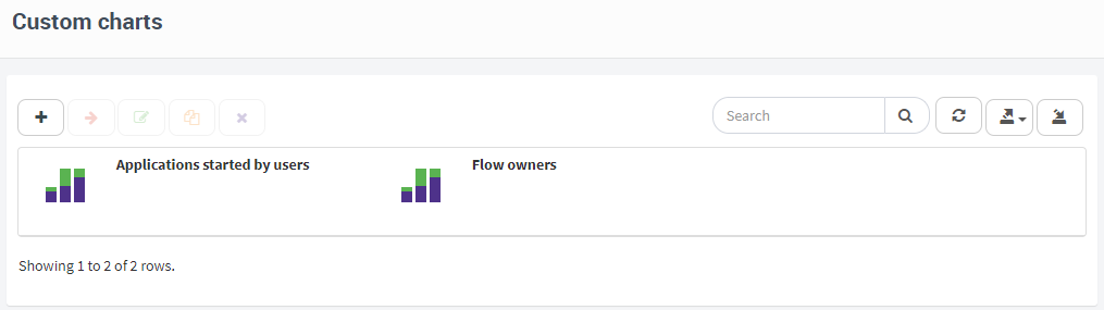
Fig. 451 Charts screen
When you have finished modifying the properties of each of these sections, you must click on “Done”. Qflow will validate the data and if there are errors, it will warn you. If you click on the error warning, Qflow takes you to the part of the screen where you can correct the error.
Next, the properties of each section of the chart definition screen are explained.
Chart creation
The procedure to create a chart is very similar to the procedure to create a view, also with options to create a chart from scratch or copy an existing one. In the same way as with views, if you want to create a chart from scratch you must select the package in which the chart will be created and the item types that will be used as data in the chart. Item types include all of those that are available for views and two additional ones:
Recent actions
My recent actions
See the view creation section (View creation) for more details.
Chart definition
The chart definition screen has the following sections:
Details
Appearance
Measure
Dimensions
Columns
Filters
Sort
Parameters
Permissions
The “Appearance”, “Measure” and “Dimensions” sections are described below. The other sections work in an analogous way to the sections with the same names on the view definition page. The “Columns” section allows you to define the columns that appear in the table that accompanies the chart and in the tables that appear when a user clicks on it. For more information on each of them, see the View definition section.
Appearance
The “Appearance” section (Fig. 452) allows you to pick the type of chart (for example, if it is a pie or bar chart). The available types are the following:
Rings: a ring chart (Fig. 459) is similar to a pie chart, but with a hole in the middle (it can also be called “doughnut chart”). See the example in Example: charts without data grouping (columns, bars, ring, circular).
Overlaid Area: a chart of an overlaid area (Fig. 466) represents the values through a line. The area under the line is painted with a color. If there is more than one series of data, one of the series is superposed to the other (as if one of them was in a paper and the other in another paper that is placed over the first one and through which it is possible to see the one below). This is where it differs from stacked areas. See an example in Example: Line chart and area chart.
Stacked area: similar to the overlaid area chart, but if there is more than one series of data, instead of overlapping the areas of each one, they are stacked (Fig. 465). A stacked area chart that was created with the same data as an overlaid area chart is taller because an area is put on top of the other (it is “stacked”). See an example in Example: Line chart and area chart.
Grouped bars: a horizontal bar chart (Fig. 463). If there is more than one dimension, data is grouped. A one-dimensional bar chart of one could have, for example, a bar for each department of the company, with each bar representing the number of pending tasks in the corresponding department. A similar chart could categorize the pending tasks of each department in three states, for example: “Pending (normal)”, “Pending (delayed)” and “Finished”. This chart would have three dimensions, one for each state. Each department would have a group of three bars, each of which would correspond to one of the three states. A group of bars shows the bars one next to the other, but grouped, close to one another, and separated from those that correspond to other groups. See examples in Example: charts without data grouping (columns, bars, ring, circular) and Example: charts with data grouping (stacked and grouped columns, stacked and grouped bars).
Stacked bars: similar to the grouped bars, but instead of showing the bars of a group one next to the other, it shows them one on top of the other, stacked (Fig. 462). See examples in Example: charts without data grouping (columns, bars, ring, circular) and Example: charts with data grouping (stacked and grouped columns, stacked and grouped bars).
Bubbles: a chart that represents values with circles, whose size is proportional to the magnitude of the represented values (see Fig. 468). These charts must have at least two dimensions, one for the ordinates (vertical axis, y) and one for the abscissae (horizontal axis, x). These two dimensions are the coordinates that determine the positions of the circles in the cartesian axis system and are also used to group the data (for each pair of unique values a circle is drawn; that is, if a pair is repeated, a single circle will be drawn for all). Additional dimensions change the way of grouping the data. In this case, new bubbles may arise with the same center as other bubbles, but with different size. For example, there may be two records with the same value for the first dimension (x), the same for the second (y) and a different value for a third dimension. If the measurement depends on the three dimensions there will be two overlapping bubbles, one with a larger diameter than the other. The smaller of the two will be marked with a different colored border, so both will be visible. See an example in Example: bubble chart.
Circular: also called “pie chart” (Fig. 458). See an example in Example: charts without data grouping (columns, bars, ring, circular).
Grouped columns: the same as grouped bars, but in a vertical direction (Fig. 461). See examples in Example: charts without data grouping (columns, bars, ring, circular) and Example: charts with data grouping (stacked and grouped columns, stacked and grouped bars).
Stacked columns: the same as stacked bars, but in a vertical direction (Fig. 460). See examples in Example: charts without data grouping (columns, bars, ring, circular) and Example: charts with data grouping (stacked and grouped columns, stacked and grouped bars).
Scatter: a scatter plot shows dots in a pair of cartesian axes (Fig. 467). The horizontal axis corresponds to the first dimension. The vertical axis corresponds to the measure. If one more dimension is added, the points are represented by colored dots and the chart displays a reference indicating which value of that dimension corresponds to which color.
Line: a chart that represents values with continuous lines (Fig. 464). If two dimensions are defined instead of one, a line will be drawn for each value of the second dimension. Each line has a different color. For example, if the first dimension is the flow’s start date and the second one is the user that started the flow, a line is drawn for each user that started a flow. Each line represents the values of the measure based on the start date of the flows. See an example in Example: Line chart and area chart.
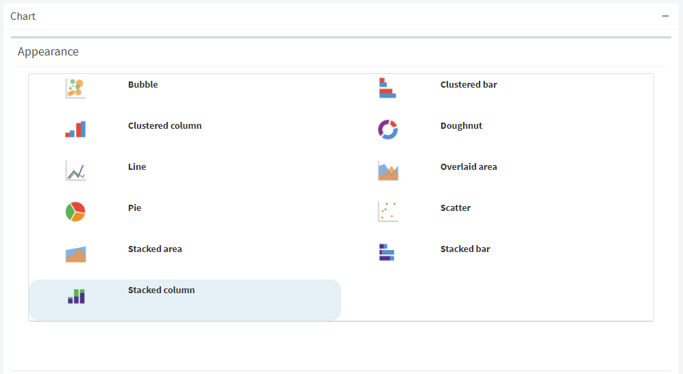
Fig. 452 Appearance: available types of charts. The icons that represent them are quite illustrative.
Measure
The measure defines the values that are shown graphically. For example: in a column graph, the measure is the value that is used to calculate the height of each of the bars. In a pie chart, the measure determines the size of each one of the pie slices. The measure is composed of the definition of a column and an Aggregation type (see below). The column must be numeric, unless “Amount” is used as an aggregation type.
The Aggregation type property defines how the column indicated in “Measure” will be used to calculate the values to be used in the chart (for these calculations, only records that have passed through the filters defined in the “Filters” tab are used). The options are the following:
Amount: it indicates that non null values of the column indicated in “Measure” should be counted. For example, if you want to build a chart that shows how many flows each user started, you can use the “Amount” aggregation type with the “Flow Correlative ID” measure. The dimension would be the “Flow starter user” column.
Maximum: it takes the maximum value of the indicated column. For example, if an application datum is chosen as a column for the measure, the chart will show the maximum value of that application datum.
Minimum: it takes the minimum value of the indicated column.
Average: the chart shows the average value of the column chosen as a measure.
Sum: the chart shows the sum of the values of the column chosen as a measure.
To choose a column:
Click on the icon that appears in the “Column” field (Fig. 453). This makes the available column list appear.
Double click on the desired column. This selects the column. To change the column, proceed in the same way.
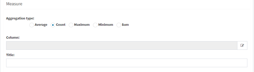
Fig. 453 Measure: the user is about to select a column
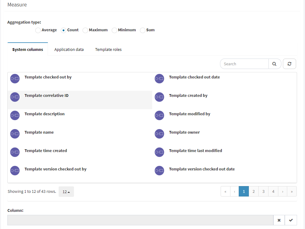
Fig. 454 Column selection: available columns
Dimensions
Dimensions define the columns that determine the values that relate to the measure. For example, assuming we want to construct a column chart and we select only one dimension, the chart will have one vertical column for each value that has the column selected as a dimension. All charts need at least one dimension, but for some you can define several.
Check the examples in Example: charts without data grouping (columns, bars, ring, circular) and Example: charts with data grouping (stacked and grouped columns, stacked and grouped bars) to see how to use these properties in specific cases.
To add a dimension, proceed in an analogous way to adding a column to a view (see Columns).
If there is more than one dimension, the dimension order matters. For example, in a two-dimensional stacked column chart, the first one is used to determine the values that go in the horizontal axis and the second one to determine the categories in which each column is subdivided. To change the dimension order, click on one of them and drag it to the desired place in the order.
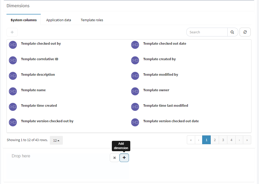
Fig. 455 Add a dimension to a chart.
Example: charts without data grouping (columns, bars, ring, circular)
Suppose that you want to construct a column chart that shows, for each user, how many templates they own. The type of chart is “Templates”, given that template data will be used, in particular, the information about who is the owner of a template. The appearance of the chart is “Stacked columns” or “Grouped columns”: it is not of importance given that we will only use one dimension (no data grouping) and the result is the same with both types of charts.
On the horizontal axis you want the names of the template owners to appear. For each of these a column should be drawn. Therefore, you should use one dimension which will be the “Template owner” column. No other dimensions are needed.
Since what is wanted is to count the templates that each user has, it is clear that the aggregation type must be “Amount”. As each template has an identifier, counting the number of identifiers is equivalent to counting the templates. As such, as a measure, you can select “Template correlative ID”.
The same data is useful to make a pie chart, with the only difference being that these are horizontal. They are also useful to make circular and ring charts, but in these cases, instead of showing the number of templates of each user, the percentage of the total that that amount represents will be shown.
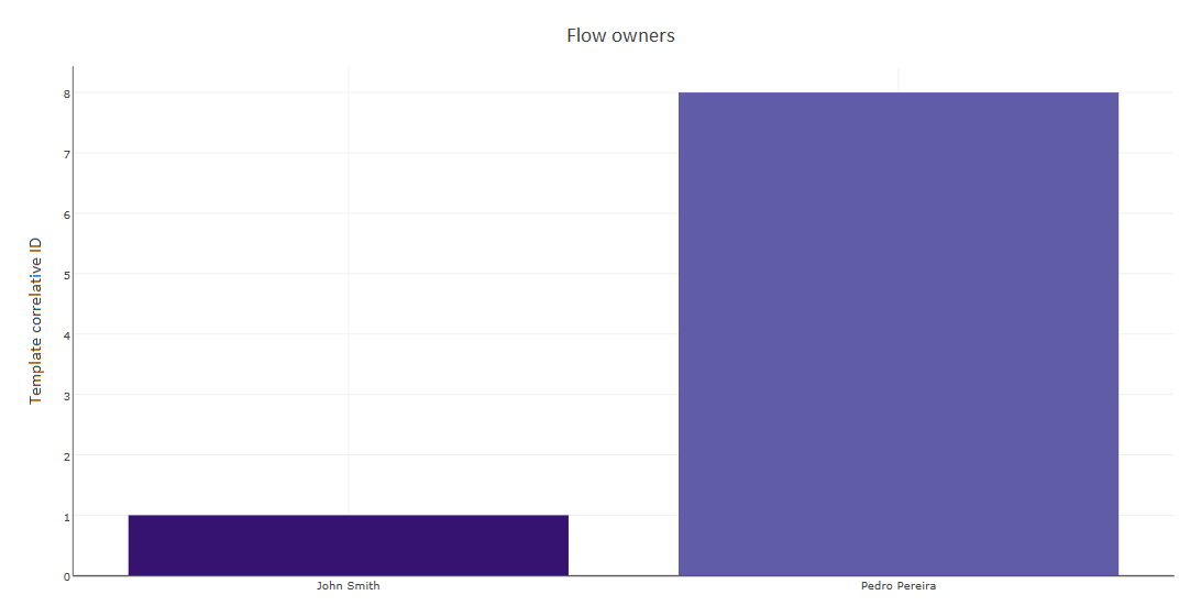
Fig. 456 Column chart
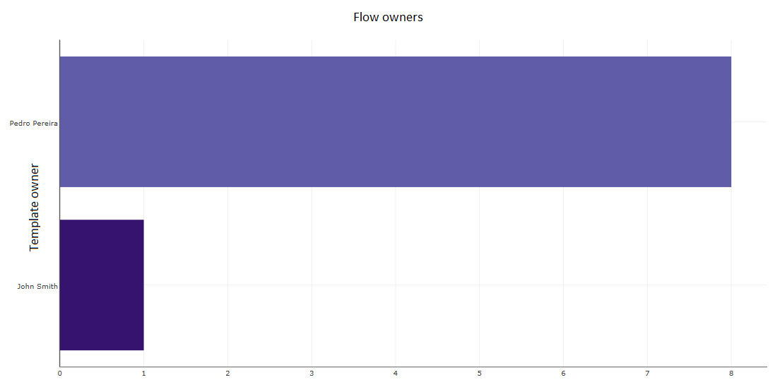
Fig. 457 Bar chart
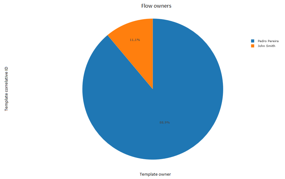
Fig. 458 Circular chart
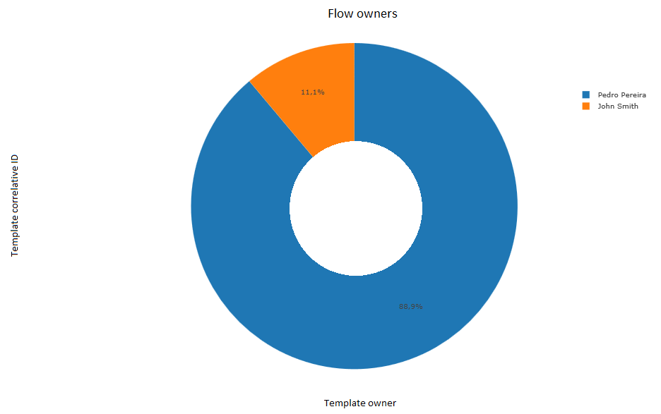
Fig. 459 Ring chart
Example: charts with data grouping (stacked and grouped columns, stacked and grouped bars)
Let us suppose that you want to construct a chart that shows, for each user, how many flows of each template they started, as is shown in Fig. 460: for each user a column is displayed and each column is divided in various sections that represent the number of flows started by that user for each template.
In this case, a chart must be created with the “Stacked columns” appearance. Since we need to use flow data, the chart type is “Flows”.
In the horizontal axis is the user that started the flow. Therefore, the first dimension that is needed is the “Flow starter user”. The second dimension is the “Template name” column, given that we want to group flows started by the same user (supposing that there are no two templates with the same name, which is reasonable).
This takes into account all templates. If we wished to exclude any, we could define a filter to do so. The same would apply if you wanted to exclude users, only consider flows started from a certain date, etc.
With the same data you can construct charts of grouped columns and bars, stacked or grouped.
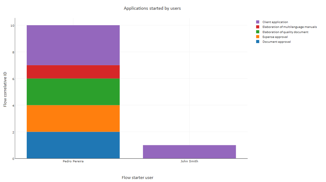
Fig. 460 Stacked columns chart
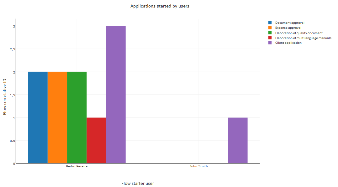
Fig. 461 Grouped columns chart
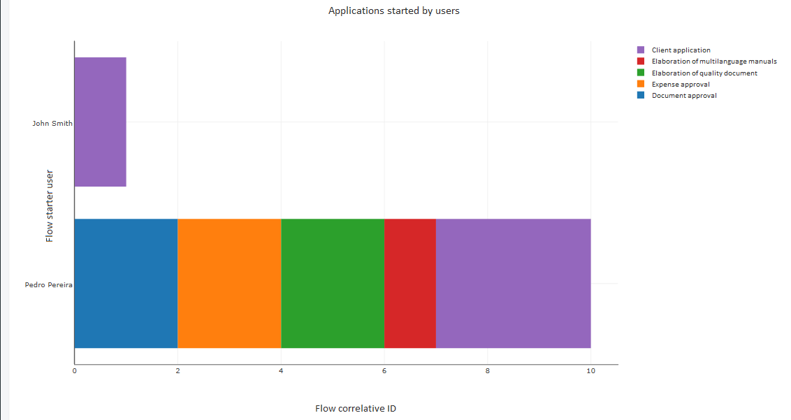
Fig. 462 Stacked bars chart
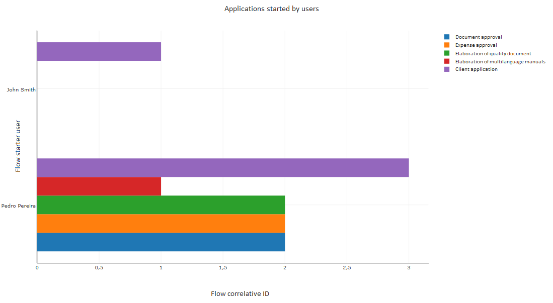
Fig. 463 Grouped bar charts
Example: Line chart and area chart
Suppose that you want to build a line chart that shows, for each user, how the number of flows they have started has evolved over time. The chart must show a line for each user, with the dates on the abscissa axis and the number of flows started on the ordinate axis.
In this case, we have two dimensions:
Date. For the date we use an application datum that has the start date, because the system column contains a date with a time, and that is not what we want. It is enough for the flow to take the starting date and store it on a Date type datum.
The “Flow starter user” system column.
The measure uses the flow correlative ID as a column, with the “Amount” aggregation type.
With the same data you can make a chart of the area. The overlapped area chart is similar to the line chart, but colors the areas under the lines. The stacked area chart sums the number of flows started by both. For example, if there are two users, one of whom started two flows on 11/20/2016 and the other started a flow the same day, the common area chart will show a value in the point corresponding to that day, and the amount 2 but in an area chart, it adds the amounts and shows the amount 3 in the point corresponding to that day.
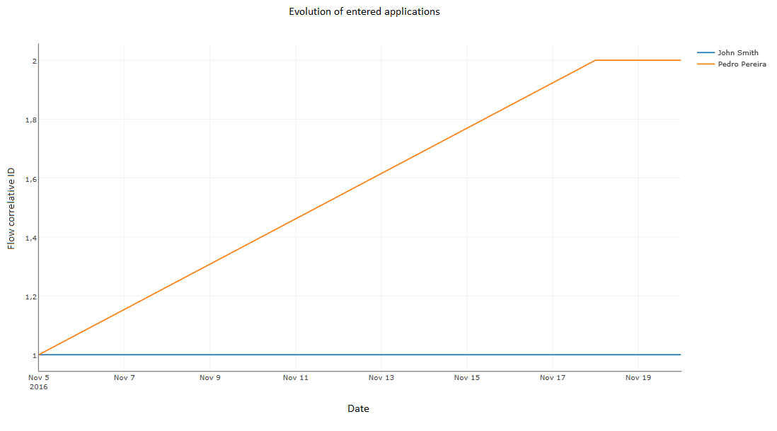
Fig. 464 Line chart
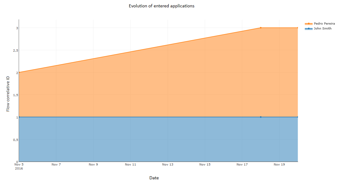
Fig. 465 Stacked area chart
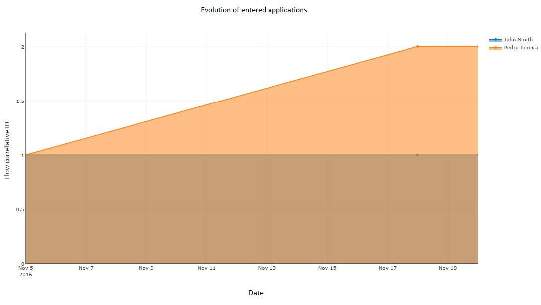
Fig. 466 Overlapped area chart
Example: scatter plot
To make a scatter plot, you can use very similar data to that of the line chart example, but the first dimension must be a number. If the example of the line chart is modified (see Example: Line chart and area chart) so that the application data with the date is of number type, you can obtain a scattering in which for each pair formed by a date and a number of applications there is a point in the plot. In the same way as with line charts, different colors are used for different users.
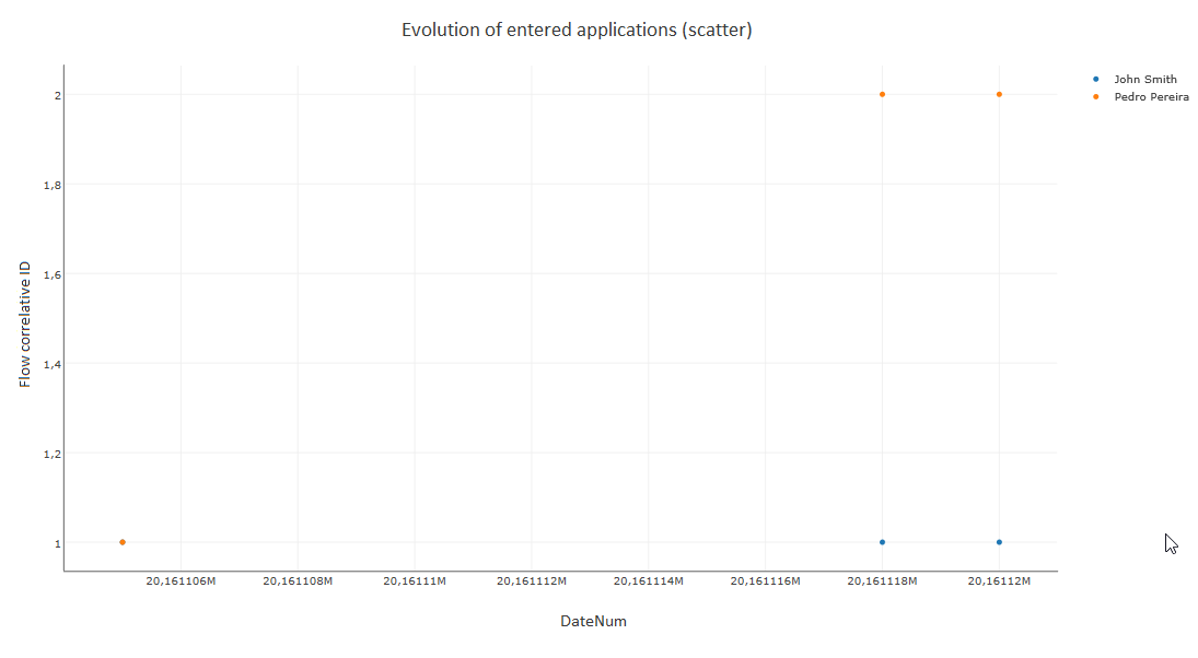
Fig. 467 Scatter plot
Example: bubble chart
A bubble chart requires at least two numerical dimensions. Let us suppose that a company has a client application flow, each application having a priority number with the values 1, 2 or 3. You want to make a chart that shows, at each date, a bubble for each priority level. The size of the bubble must be proportional to the time average, expressed in hours, that it took to resolve the application. The chart will have the following dimensions:
Date: an application datum of numeric type that represents the date (for example, the number 20161118 represents the November 18th, 2016 date; the same as in the example of the scatter plot).
Priority: a numerical application datum that represents the application’s priority.
For the measure, as a column we choose the “Response type” application datum, which has a number that indicates the number of hours that it took to resolve the application, with the “Average” aggregation type.
The result is shown in Fig. 468.
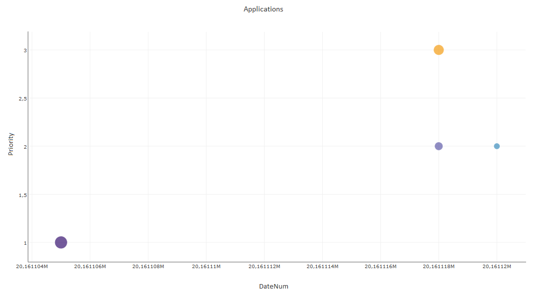
Fig. 468 Bubble chart
Importing and exporting charts
Charts are exported and imported in an analogous way to views. See Import and export views for more information.
Indicators
Qflows allows you to create indicators that make calculations with the data of flows, getting a result which is represented by a number and a figure that adds meaning. For example, you could define an indicator of the number of pending tasks and if it is higher than a specific number, show the result in red.
Just like with views, for each indicator you can define if it is displayed in the sidebar menu or not. Indicators that are included in the sidebar menu are shown as sub options of the “Indicators” option in that menu. The other indicators are accessible from the indicators screen, which you can access by clicking on the “Indicators” option. This screen is also used to create and modify indicators. It also allows importing and exporting indicators.
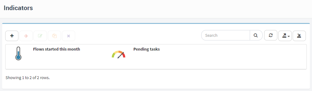
Fig. 469 Indicator screen
When you have finished modifying the properties of each of these sections, you must click on “Done”. Qflow will validate the data and if there are errors, it will warn you. If you click on the error warning, Qflow takes you to the part of the screen where you can correct the error.
Next, the properties of each section of the indicator definition screen are explained.
Indicators creation
The procedure to create an indicator is very similar to the procedure to create a view, with the option to create an indicator from scratch or to copy an existing one. In the same way as with views, in the case of creating an indicator from scratch, you must select the package in which the indicator will be created and the type of items that will be used as its data. The types of items are the same ones that are available for charts, meaning, the same ones as for views, plus “Recent actions” and “My recent actions”.
Indicator definition
The indicator definition screen has the following sections:
Details
Ranges
Formulas
Filters
Parameters
Permissions
Next, the Details, Ranges and Formulas sections are described. The remaining ones work in an analogous way to the sections with the same names of the views definition screen.
Details
The details section is similar to the one in views, but contains two additional properties:
Appearance: it indicates the figure that will be used to represent the indicator. The options are:
Gauge: an image of a gauge that marks a value in a graduated scale, similar to a velocimeter (Fig. 470, to the left). The scale is divided into ranges of different colors. These ranges are the ones defined in the “Ranges” tab. Each range is shown with the color that was defined for it.
Semaphore: the value is shown over a background of the color that corresponds to the range it belongs to. (Fig. 471).
Thermometer: a thermometer drawing is shown that marks the represented value (Fig. 470). The color of the column that the thermometer marks is the one corresponding to the marked value according to the range it belongs to.
Decimal digits: the number of decimal digits that will be taken into account for the result of the indicator’s calculations.
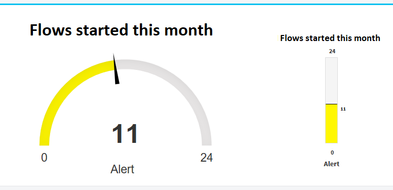
Fig. 470 Gauge and thermometer
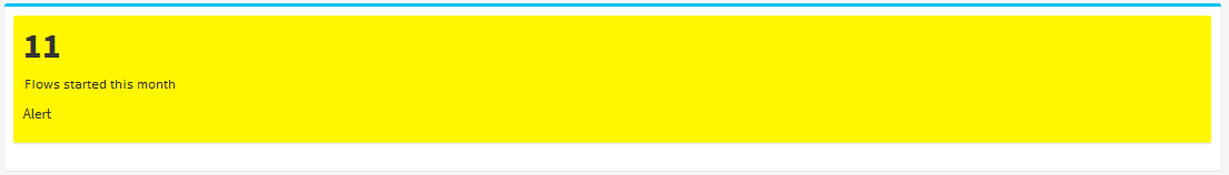
Fig. 471 Semaphore
Ranges
In the “Ranges” section the ranges that allow you to categorize the values that the indicator will show are defined. Each range is associated with a color. In the example figures, the value that is shown in the indicators is in a range that was associated to the color yellow.
To add a range, click on the icon with the “” symbol. This makes Qflow add the new range to the list of ranges, with a default name, and show a bar that visually represents the ranges. When you have just added a range, the bar shows it with a random color and limit values of 0 and 50 (Fig. 472). To modify the range’s properties, click on it. Qflow then shows, next to the ranges list, the range’s properties (Fig. 473):
Name: the name of the range is shown in the indicator when a value belongs to the range.
Limits: the two numbers that define the range.
Color: a color that is associated to the range. To modify the color the color selector must be used (Fig. 473).
Fig. 472 Add a range

Fig. 473 Range properties
Formulas
In the “Formulas” section, how to calculate the value shown in the indicator is defined. The formula is represented by a tree that has a node for each operation and for each operand (Fig. 474). In the figure’s example, the sum of all “Purchases” values is subtracted from the sum of all “Sales” values. The tree is defined from the root, at the top, downwards. Therefore, the first thing to be defined is the last operation to be executed (the root), which is the one that results in the value of the indicator. Next, the operands of that operation are defined. These operands can be the result of other operations, which in turn can also have operands, which can be the result of operations, and so on.
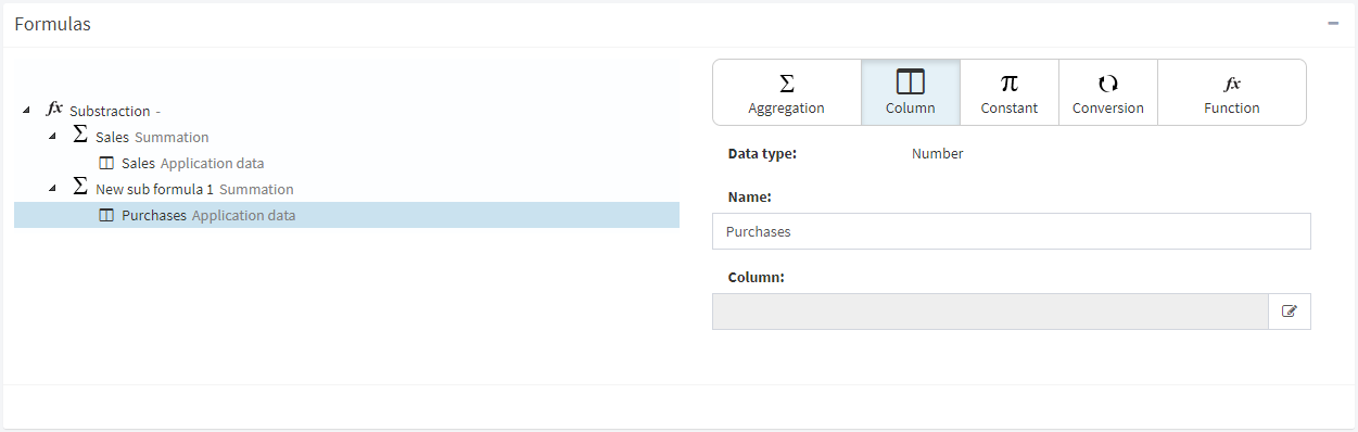
Fig. 474 A formula that subtracts, from the sum of “Sales” data values, the sum of “Purchases” data values. The last node is of “Column” type and its properties are shown next to the tree
The nodes of the tree can be of several types, each of which is associated to a type of operation or operand. In the tree, the type of a node is represented by an icon (Fig. 475).
Fig. 475 Buttons to assign types of node, with the icons that represent each type.
Next, each of the types of elements are explained:
Aggregation: an aggregation node is an operation that takes a set of data (for example, all the records of flow application data) and uses them to calculate a value. An example of an operation of this type is to calculate the average. These operations are listed and described further down.
Column: a system column or application datum. A column determines a set of data that can be used as the input of an aggregation operation.
Constant: a fixed value of some type. The type of value has to be compatible with the type of value that the operation that will use it expects as an input. Qflow controls this.
Conversion: an operation that converts the input parameter to the data type that the operation that uses its result expects as an input.
Function: a function takes parameters and applies some standard function to them, like for example, arithmetic operations. There are also date or text string manipulation functions. A detailed description of each of the available functions is given further down.
When you start defining a formula, it has only one node in which no operation and no operand are specified. To assign an operation to a node, select it and click the button corresponding to the desired node type (Fig. 475). This will display, next to the tree, a box with the properties of the node type (this box is also displayed if you select a node that already has a type assigned to it; see Fig. 474).
The following explains how to specify the properties of a formula node, depending on its type. In all cases, you can enter a name for the node. This name is displayed in the formula tree, next to the icon representing the node type.
Aggregation
An aggregation node allows you to choose one of the following operations, which are applied to the child nodes of the aggregation node. These operations take all input values (for example, all values of an application data) and as a result return a number. For example, the “Maximum” operation returns the maximum of all such values.
Amount: the number of records that the operand has.
Maximum: the maximum value of all the values defined by the operand.
Minimum: the minimum value of all the values defined by the operand.
Average: the average of the values defined by the operand.
Sum: the sum of all the values defined by the operand.
Example: if the “Amount” operation is selected and it is applied to a column that corresponds to an application datum, the result will be the number of values that the application datum has. If the “Sum” operation is selected, it will be the sum of the values of that datum.
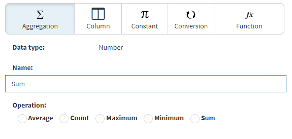
Fig. 476 Properties of an aggregation node.
Column
A column type node indicates an application datum or a system column to be used as input for some operation.
To select a column, click on the corresponding icon (Fig. 477). Qflow shows two tabs, one with application data and another one with system columns. Search for the data or column that you wish to use and click on it. Then, click on the confirmation icon (Fig. 478).
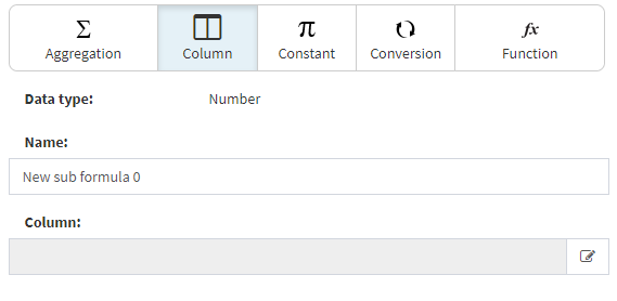
Fig. 477 Selection of a column
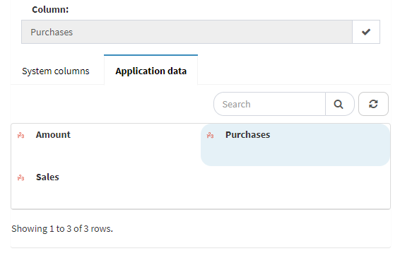
Fig. 478 Selection of the “Purchases” application data as column.
Constant
In the case of a constant, the desired value is entered.
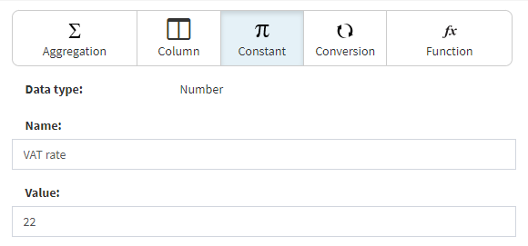
Fig. 479 Constant definition
Conversion
In the case of a conversion, the type of the data you wish to convert is selected. This tells Qflow how to interpret the values that will be converted. These values are converted to the type of data that the operation indicated in the conversion’s parent node needs.
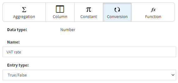
Fig. 480 Conversion
Function
There are various function categories. For example, there are functions for arithmetic operations, but there are also functions to manipulate dates. Which functions are available for a certain node depend on the data type that the parent node expects. For example: the result of the root node must be a number. Thus, arithmetic operations are available for that node, but operations whose results are text or dates are not.
Date and time functions
Year: given a date, it returns the year to which it belongs. For example, if the date is 10/22/2013, the result is “2013”.
Day: given a date, it returns that date’s month’s day number. For example, if the date is 10/22/2013, the result is “22”.
Days between: given two dates, it calculates the number of days between the two of them. If the first date is later than the second one, it returns a negative number. The result of this function can have fractions if the dates have different hours.
Current date: it is a function with no arguments whose result is the current date.
Hour: given a date, it returns the number corresponding to the hour. For example, if the date is “10/22/2013, 15:54”, it returns “15”.
Hours between: given two dates, it returns the number of hours between both of them. If the rightmost date in the tree is earlier than the leftmost date, it returns a negative number. The result of this function can have fractions if the dates have a different number of minutes.
Month: given a date, it returns the number corresponding to that date’s month (for example, if it is a date in May, it returns “5”).
Minutes: given a date, it returns the number that corresponds to that date’s minutes. For example, if the date is “10/22/2013, 15:54”, the result is “54”.
Minutes between: given two dates, it returns the number of minutes between them. If the rightmost date in the tree is earlier than the leftmost date, it returns a negative number. The result of this function can have fractions if the dates have a different number of seconds.
Seconds: given a date, it returns the number corresponding to that date’s seconds. For example, if the date is “10/22/2013, 15:54:14”, the result is “14”.
Numeric functions: these functions are represented by the usual symbols (for example, “+” for the sum). To select one, click on the button with the symbol.
Division: it divides the first input number by the second. If there is a third number, it divides the quotient obtained by it and so on.
Product: the result of multiplying the input parameters.
Subtraction: subtraction of the input parameters (the first minus the second minus the third minus the fourth, and so on).
Sum: sum of all operands.
Text functions
Concatenation: it concatenates various texts (it joins them one after the other, in order, creating a new text).
Index of: a function that indicates the position of a subtext in a text. It has three arguments:
Text: the text in which you want to search for another text.
Subtext: the text that you want to find.
Starting position: the position from which Qflow must search for the text indicated in “Subtext”.
Example: if the text is “Qflow”, the subtext “flow” and the starting position is 0 (0 is the first position; 1 is the second, etc.), the result is 2.
Length: a text’s number of characters.
Substring: the result of this operation is to return a part of a text. This operation has three arguments:
Text: the text from which you want to obtain a part.
Starting position: the starting position of the part that you want to get from the original text. The position of the first character is 0; the second is position 1; and so on.
Length: the length of the text that you want to obtain from the starting position. Example: given the text “The date is 10/10/14”, to get the “10/10/14” substring you must specify the starting position 12 and a length of 8 characters.
Trim: it removes the spaces at the beginning and the end of a text.
Logical functions
No: logic negation (“NOT” operation). If the operand has a value of “True”, the result is false, and vice versa.
Or: logical disjunction (“OR” operation), whose result is “True” if and only if some of the operands has “True” as a value.
And: logical conjunction (“AND” operation), whose result is “True” if and only if all of the operands have “True” as a value.
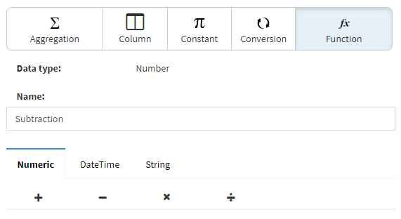
Fig. 481 Selecting a function.
Filters
Filters allow you to restrict the data that intervenes in the indicator calculations. For example, in a formula that sums all values of an application datum that is common to flows from various templates, you could want to sum only the values of the datum from one of those templates. Filters are defined in the same way as the views filters (see View definition).
Parameters
Just as with filters, parameters allow you to restrict the data that intervenes in the indicator calculations, but by entering values to compare when viewing the indicator. Parameters are defined in the same way as view parameters (see View definition).
Permissions
They allow restricting the access to the indicator. They are defined in the same way as view permissions (see View definition).
Importing and exporting indicators
Indicators are exported and imported in an analogous way to views. See Import and export views for more information.
Dashboards
A dashboard is a page that combines views, indicators and charts.
In the same way as with views, for each dashboard you can define if it will be displayed in the sidebar menu or not. Dashboards that are included in the sidebar menu are shown as sub options of the “Dashboards” option in that menu. The remaining dashboards are accessible through the dashboards screen, which you can access by clicking on the “Dashboards” option. This screen is also used to create and modify dashboards. It also allows importing and exporting dashboards.

Fig. 482 Dashboard screen
Dashboards creation
The procedure to create a dashboard is similar to the procedure to create a view, also with the options of creating a dashboard from scratch, or copying an existing one. In the same way as with views, in the case of creating a dashboard from scratch, you must select the package in which the dashboard will be created, and indicate whether it is a public or personal dashboard. A personal dashboard can only be seen or modified by the user that created it.
Dashboard definition
The dashboard definition screen has a details section and a permissions section. This screen is not for defining which elements comprise the dashboard. That is defined in the page that appears when viewing the dashboard.
Details
The details of the dashboard are similar to the ones in views: they include their name, description and a field that indicates if the dashboard should be included in the sidebar menu (“Highlight dashboard”).
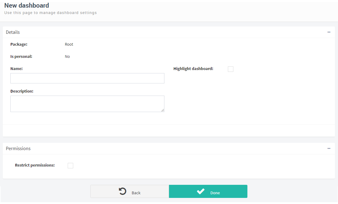
Fig. 483 Dashboard definition
Permissions
The permissions section of a dashboard is slightly different from its equivalent in views, charts and indicators, because for a dashboard there is more than one permission: since the page in which a dashboard is viewed is also the page in which you edit the elements that will comprise it, a dashboard’s permissions indicate if it can be seen, but also if it can be modified. This is not shown if the dashboard is personal. When you add a member to the list of members with permissions, a table appears in which you must check “Allowed” or “Denied” in each permission.
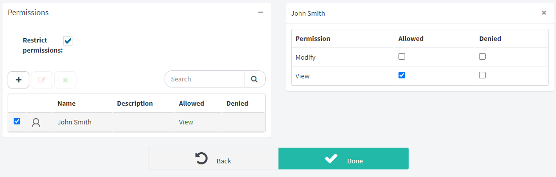
Fig. 484 Dashboard’s permissions
Modifying what is shown in a dashboard
To define what elements are shown in a dashboard, the same page in which you view it is used. Only users that have permission to modify the dashboard can change the elements that are shown in it.
When you enter the page that shows a dashboard, if it is empty a page similar to the one in Fig. 485 is shown. To add elements, click on the link that says “You can add new items clicking here”, or click on the pencil icon (“ ”) that appears in the upper right corner, which allows you to modify the dashboard. Then, Qflow shows the available elements, each type in a tab (views, charts and indicators; Fig. 486).
To add an element, double click on it, or drag it down, dropping it in the “Drop here” area, located in the lower part of the screen. To remove an element, click on the cross that appears in the upper right corner.
Generally, it will be necessary to modify the element’s size. To do this, click on one of the icons that appear in both lower corners. Hold the mouse button down and drag it until the element has the desired size (Fig. 487).
Once the editing has been finished, click on the save button (“ ”).
”).
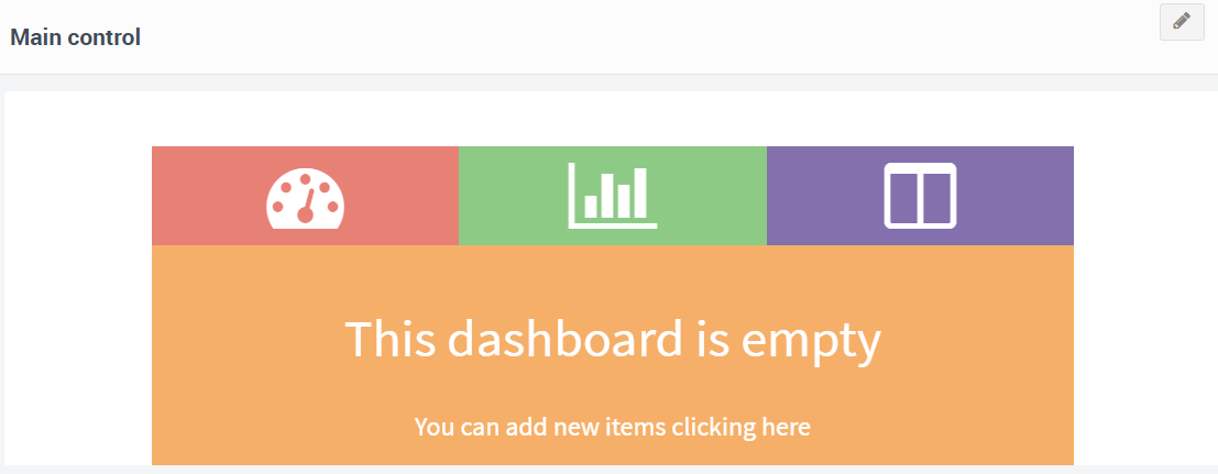
Fig. 485 Empty dashboard
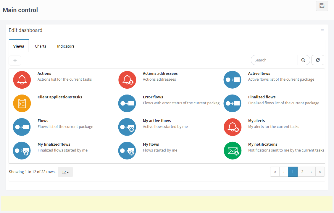
Fig. 486 Selecting elements for a dashboard
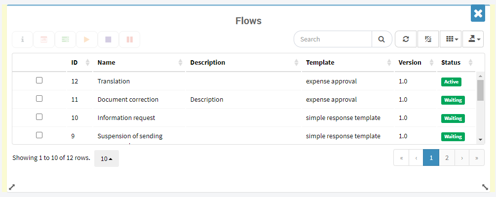
Fig. 487 Flow view in a dashboard. The user is changing its size (note the cursor on the lower right corner). There is a cross in the upper right corner that, if you click on it, removes the view from the dashboard.
Importing and exporting dashboards
Dashboards are exported and imported in an analogous way to views. See Import and export views for more information.
Administration and configuration
Qflow Task’s administration and configuration options are available in the upper menu. In the “Configure” link, the options are:
Customize the sidebar menu: allows the customization of the sidebar menu of Task. This customization will apply to all users of the workspace.
My links: allows the definition of personal links (only visible to the user who defined them) which are shown below the elements of the sidebar menu. The configuration is analogous to the sidebar menu’s customization, allowing you to creat a structure of folders, links and sublinks.
System views: it allows you to modify system views, such as the “Flows”, “Tasks” and “Notifications” views, which are defined by default in Qflow.
Work queue inboxes: it allows you to define which views are included in the inbox of each work queue.
Package settings: templates and flows are organized in packages. This section allows you to assign package access permissions to users.
Tool settings: it allows you to define access permissions to the site itself.
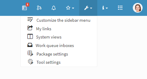
Fig. 488 Administration and configuration settings
In the “User configuration” link (this link is only visible if you have a sender configured), the options are:
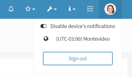
Fig. 489 Options with enabled device notifications
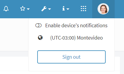
Fig. 490 Options with disabled device notifications
Device notifications configuration: it allows you to enable or disable the device’s notifications.
Time zone configuration: it allows you to change the user’s time zone.
This configuration will be shown under the “Configure” link, with the rest, when the screen that is being used is of small resolution.
Each of these options is explained in detail below. But first, how permissions are assigned on Qflow Task is explained.
Permission management
Several of the elements managed by Qflow Task can have access permissions defined. It is possible to restrict the access to views, packages, sidebar menu items and other elements.
This section explains the general aspects of managing permissions in Qflow Task. A permission sets out which users can access a given resource and what they can do with that resource. Therefore, when defining a permission, it is necessary to define who the permission is being given to and what operations are included in that permission.
Roles and role types
To specify who is being granted permission, roles are used. There are several types of roles:
Roles: they are security roles. These are defined in the Qflow Team. Giving a permission to a role is equivalent to giving that permission to the users that perform that role. If one of those users stops performing said role, they will no longer have that permission (unless they have the same permission through another role or group). If a user that does not perform that role starts performing it, the user will then have that permission.
Groups: they are entities that allow you to group users and roles that have the same permissions. Groups are defined in the Organizational Model Manager. Giving a permission to a group is equivalent to giving the permission to all of its members. If one of those users is removed from the group, they will no longer have that permission (unless they have the same permission through another role or group). If a user that was not a member of the group becomes one, they will now have that permission.
Users: they are the specific users of Qflow.
Nodes: they are the nodes of the Qflow Team hierarchy. A node is usually associated to a department of an organization. All users belong to a node. Giving a permission to a node is equivalent to giving that permission to all users of that node, in a similar way to how groups work.
Work queues: they are a particular type of node.
When Qflow shows a list of permissions that have already been assigned, it shows the name of the role to which the permission was assigned, the operations included in it, and the type of role to which the permission was assigned. The latter field is indicated by an icon that represents the type of role. Fig. 491 shows the correspondence between icons and role types.
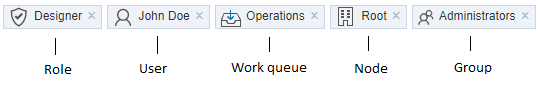
Fig. 491 Example of how a role, a user, a work queue, a node and a group are shown in a permissions list.
In some cases, the operation to which the permission is referring to is not shown because it is implied. For example, when permissions to a view are restricted, the name of the operation to which the permissions refer is not displayed because these are always permissions to see the view. The same goes for sidebar menu items, charts and indicators.
Operations included in permissions
The operations that can be included in a permission depend on the resource to which the permission applies. For example, the dashboard access permission involves two operations: modifying the dashboard and viewing the dashboard. In general, for each permission two things can be indicated:
If the operation is allowed to be executed.
If permission to execute the operation is denied.
A user has permission to perform an operation over some element if and only if the following conditions are simultaneously met:
There is some permission granted to the user that allows them to perform the operation over the element in question. For example, the user has the permission, or some of the user’s roles or groups have the permission.
There is no permission specification that explicitly denies the user permission. That is: none of the user’s roles, groups, etc. have their access denied to that permission.
Sidebar menu customization
The sidebar menu customization page allows you to create, modify and delete the elements that appear on the sidebar menu. This configuration will apply to all users in the workspace. Here, you can also import and export your settings.
In this page, Qflow shows a tree structure with the items of the sidebar menu (Fig. 492), where they can be seen in the order they appear and how they are grouped on the menu.
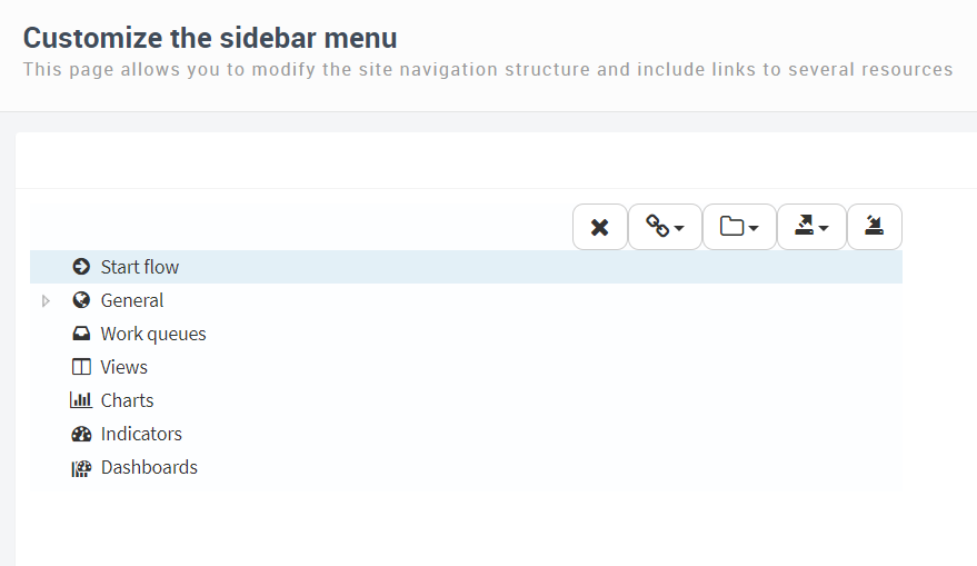
Fig. 492 Sidebar menu’s item tree
In the sidebar menu’s configuration page, a tree structure is shown, consisting of links and folders. A folder can be used to group links, and it will display the links and folders it contains when clicked (without navigating to another page). A link can also be used as a container, as if it were a folder which, besides grouping elements, contains a link on itself, therefore a link can both contain folders and other links.
For folders, the configuration allows you to configure the following fields:
Name: name for the folder on the menu.
Description: a description of the folder.
Icon: icon that will be shown with the folder on the menu. Typing on this field will display a list of icons that match with the search, allowing the user to click on one of them to select it.
Restrict access: if this option is checked, it allows specifying roles, users or nodes that will be allowed or denied access to the folder. If no Qflow members are added to the list, no permissions will be restricted. If at least one member is defined, the list will be used to determine who has permission to see the folder.
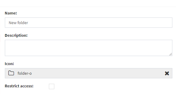
Fig. 493 Sidebar folder configuration
For links, there are two types: custom and system links:
Custom links are those that lead to user-specified addresses. These can be used to access sites that are external to Qflow Task when clicked.
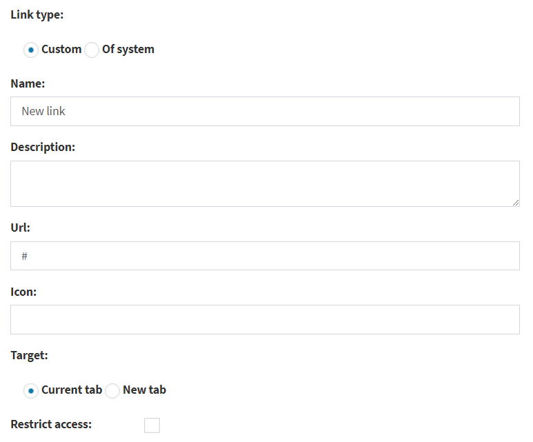
Fig. 494 Sidebar’s custom link configuration
The specific properties of custom links are:
Name: name that is shown on the menu for the item.
URL: Web address to which the element will be taken when selected. This can be an absolute address, in which case it must be a complete address (i.e., complete with its protocol, starting with “https://” or “http://”)
System links are shortcuts to different pages inside of Qflow Task, for example, the flow start section, the list of views, charts, or indicators, and more. The available options are shown in a dropdown list in the item’s configuration.
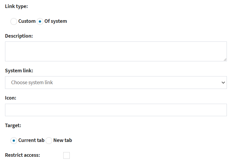
Fig. 495 Sidebar’s system link configuration
The specific properties of system links are:
System link: dropdown list that shows the options for different sections of the site that will be opened when clicking on the link. The link will be shown with the name of the element that was selected on the dropdown list.
In addition to the specific properties of each type of link, the following properties, which are common to both types can be configured:
Description: a short description of the link.
Icon: icon that will be shown with the link on the menu. Typing on this field will display a list of icons that match with the search, allowing the user to click on one of them to select it.
Target
Current tab: if this option is selected, when a user clicks on the link, the browser will open it in the tab in which they clicked on the link, so they will leave Qflow Task and navigate to the page to which the link refers.
New tab: if this option is selected, when a user clicks on the link, the browser will open the link in a new tab.
Restrict access: if this option is checked, it allows specifying roles, users or nodes that will be allowed or denied access to the link. If no Qflow members are added to the list, no permissions will be restricted. If at least one member is defined, the list will be used to determine who has permission to see the link.
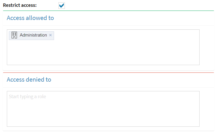
Fig. 496 Restrict permissions for sidebar menu links and folders
Changes in the menu’s configuration are only saved when you click on the “Save” button.
In the upper right part of the box where the tree is shown there are icons that allow you to perform operations: delete the selected item, add a link and add a folder. Fig. 497 shows the icons and their meanings. To view and edit the properties of a link or folder, select it in the tree. To change its place in the tree, select it and while holding down the left-click on the item, drag it to the desired order.
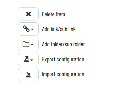
Fig. 497 Buttons for modifying the link tree
To create a link or folder, click on the corresponding button. This makes Qflow add the new element to the tree, with the name “New link” or “New folder”. You can then select it to modify its properties.
My links
The concept and configuration of “My links” is analogous to the sidebar menu’s configuration, with the main difference being that these elements will be shown on the sidebar menu below the elements defined on the menu itself, and they will only be shown to the user that defined them.
Excluding the restriction of permissions, which does not apply for these personal links, everything explained for the management and configuration of the sidebar menu applies in the same way for this section.
System views
The system views configuration page allows you to modify the views that are already pre-defined in Qflow. You can alter the order of the columns that they contain or modify them to show more or less columns.
System views are modified in the same way as custom views. Refer to the View definition section for instructions on how to modify them, System views are of the same types as common views, but there is an additional type, “Tray”, which are views that are used in work queues trays.
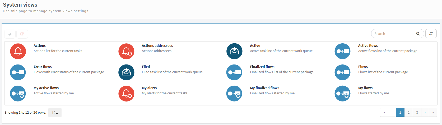
Fig. 498 System views
Work queues trays
The trays administration page allows you to define which trays views are included in each tray. Each work queue has a tray associated to it. You can define what views must be included in it.
It also includes links, accessible from an icon in the upper right part of the screen:
Manage system tray: it redirects to a page in which you can determine which views the system tray has. This tray is the one that is associated by default to work queues. As such, if a new work queue is created, it will have the views that this tray has. The way of specifying the views of this tray is the same as for other trays (see below; also see Fig. 500).
Manage work queues: it allows you to create, modify and delete views from work queues, meaning, the views that can be used in the queues’ trays. These views are created and defined in the same way as other views (see Views), but for these views, you do not choose what their type is (they are all “Tray” type).
When a user enters this page, the Qflow Team node tree is shown for the user to select the work queue whose tray they wish to modify (work queues are special nodes; for more information about nodes and work queues, refer to the Qflow Team manual). Apart from work queues, nodes are shown, because a work queue can belong to a node that is not a work queue. Expand the corresponding nodes or work queues until the work queue for which you want to define a tray is found.
When you select a work queue, the “Customize views for this inbox” option is displayed next to the image, with the list of views that are currently in it.
By default, a work queue has the views of the system tray.
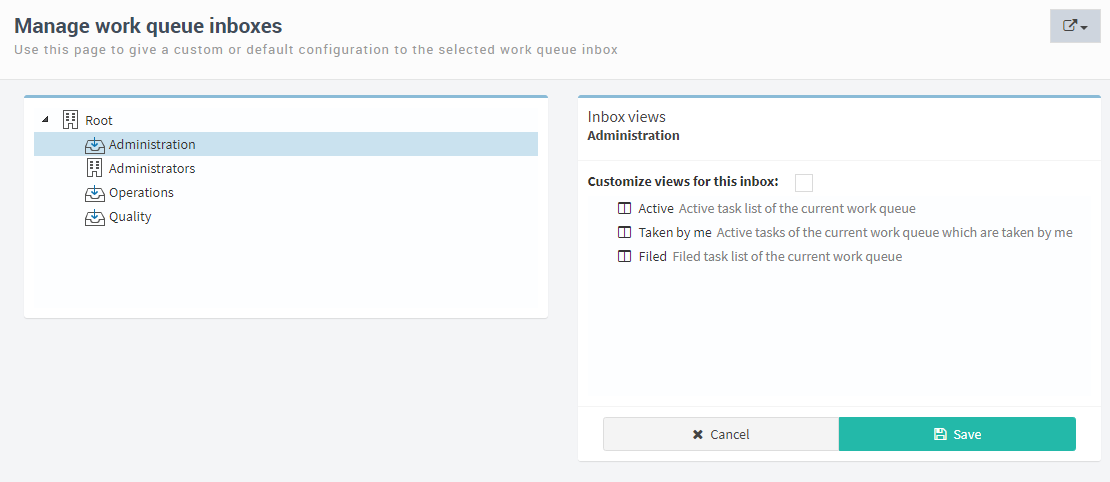
Fig. 499 Manage work queues
To add or remove views from the selected tray, check the “Customize views for this inbox” option. This clears the list of views, and displays buttons to add and delete views. These options are the ones that appear when the system inbox views are being managed.
When you click on the add button (), the available views to add to the inbox appear. They are the same views that a work queue has by default. Drag the ones you want to the “Drop here” area. When you are done, click on “Save”.
Fig. 500 Customize views for this inbox
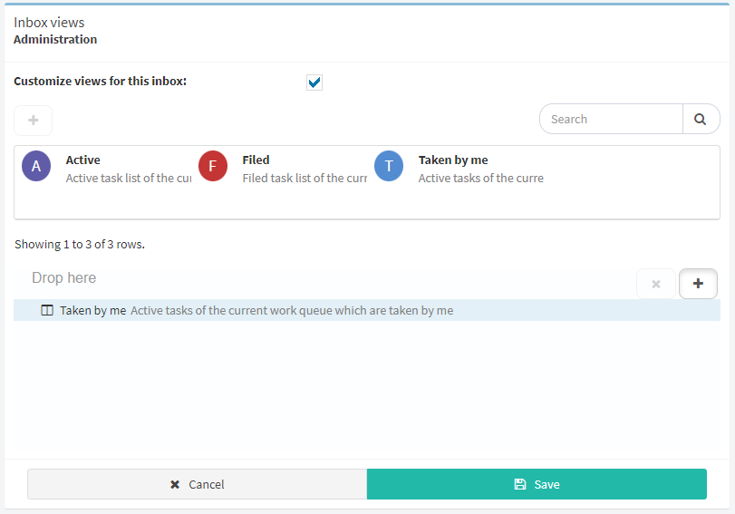
Fig. 501 Add a view to an inbox
Package permissions
The package permissions screen allows you to assign permissions to perform actions on templates, flows and tasks. These elements are organized in a package structure similar to the folder structure in a file system. This structure can be modified in the Qflow Design (see the Qflow Design (see the Business Process Modeler manual for permissions are the following:
Manage flows: it allows performing operations on the flows of the current package, such as ending a flow, making it step back or retry the execution of steps.
Manage charts: it allows creating, modifying and deleting charts and conferring permissions over them, such as importing and exporting chart definitions.
Manage indicators: it allows creating, modifying and deleting indicators and conceding permissions over them, as well as importing and exporting indicator definitions.
Manage security: it allows modifying the security configuration of the current package.
Manage main dashboard: it allows modifying the main dashboard, which is the one shown in Qflow Task’s home page.
Manage dashboards: it allows creating, modifying and deleting dashboards and conferring permissions over them, as well as importing and exporting dashboards definitions.
Manage sidebar menu: allows customizing the sidebar menu of Qflow Task, which includes creating, modifying and deleting links, as well as restricting the access to them and being able to import and export the configuration.
Manage views: it allows creating, modifying and deleting views defined on elements of the current package, as well as importing and exporting view definitions.
Audit: it allows you to view auditing information on the items in the package.
Delegate task: it allows delegating tasks and reassigning them.
Drill down: it allows viewing flow details in the current package (seeing all of the data, roles and attachments of the flow in the details view).
Start flow: it allows you to start flows based on templates from the current package.
Respond tasks: it allows you to respond to tasks of the current package. A user can respond to a task if they are an addressee of said task, a substitute or supervisor of an addressee.
View statistics: it allows you to view statistics of items in the package.
View items: it allows you to view the elements of the current package.
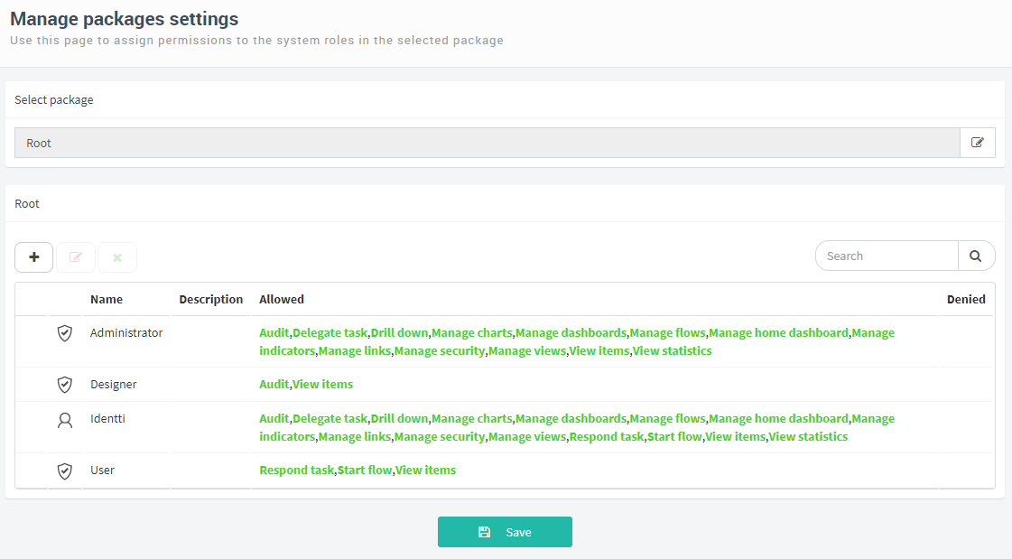
Fig. 502 Package permissions
By default, the package permissions page displays the permissions of the Root package. To select another package, click on the select package button ( ), which appears next to the selected package name. This causes Qflow to display the package tree and change this icon to a confirmation icon (
 ). Double-click on the desired package, or select it and click on the confirmation icon.
When you add a permission, after you have selected the member to which you want to grant or deny permissions, a box appears to the right of the list of permissions that allows you to check which permissions you want to assign or deny (Fig. 505). This box also appears when you are editing a member’s permissions for that package.
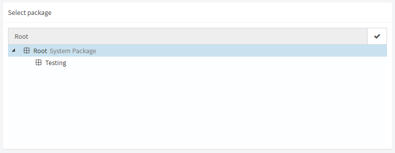
Fig. 503 Selecting a package
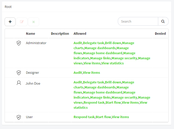
Fig. 504 Selection of member to modify permissions
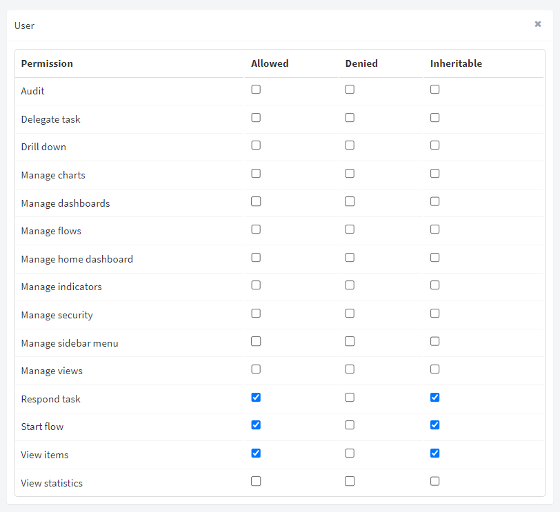
Fig. 505 Modifying permissions
Tool permissions
The tool permissions screen allows you to define who can access the site and if they can manage security aspects or not.
The two possible permissions are:
Manage security: it allows you to manage the security of the Qflow Task, i.e., to modify the general configuration.
Access tool: it allows you to access the Qflow Task.
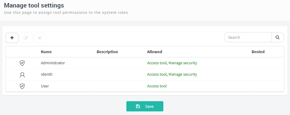
Fig. 506 Manage tool settings
To add a permission:
Click on the “
” icon. This makes Qflow show, in the upper left corner of the screen, a text box to enter the name of a member to which you can grant permissions.Start typing the name of the member for Qflow to show the list of members whose name contains the entered text and select the desired member. Qflow will add the member to the list and show, to the left, a box in which you can check which permissions the member will have. By default, the “Access tool” permission is checked (Fig. 507).
Modify the permissions to your liking and click on “Save”.
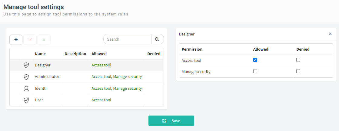
Fig. 507 List of permissions in which you just added the “Designer” role, with a box to the right to add permissions.
Device notification settings
To be able to use device notifications you must have a user notification sender correctly configured. For more details, see the Qflow Admin manual.
You must also have the corresponding sender selected for the user. See the Qflow Team manual. If not, you will not receive device notifications, even if they are enabled.
Manage device notifications
When you enter the Qflow Task for the first time and have the sender properly configured in SAM, a pop-up message will be shown, which asks if you wish to enable device notifications, with 3 options: Yes, No, and Close (‘x’). See Fig. 508.

Fig. 508 Pop-up message to enable device notifications when you enter the Qflow Task for the first time.
If you select “Close”, this will be interpreted as you not wanting to make the decision at the time, so the pop-up message will be closed and will be shown again when you return to the site after 7 days or when you clear your browser data.
If you select the “No” option, the preference will be saved and the pop-up message will not be shown again.
If you select the “Yes” option:
If you never configured notifications on the browser that is being used (for example Chrome) the browser’s native pop-up message will be shown, where you can allow notifications, block them or close the message. See Fig. 509.
If at this point you decide to close the pop-up message, notifications will not be enabled on Qflow Task. The tool will ask again in 7 days, if you wish to enable notifications.
If you decide to block browser notifications, Qflow Task notifications will not be enabled, and Qflow Task will ask again in 7 days.
If you select the allow option, Qflow Task notifications will be enabled.
Fig. 509 Configuring notifications in a Google Chrome browser.
If the user has browser notifications already configured (blocked or enabled):
In the case of them being enabled, notifications will be automatically enabled when you select the “Yes” option in Qflow Task’s pop-up message.
In the case of them being blocked, if you select the “Yes” option, an alert will be shown (Fig. 510) indicating that you have browser notifications blocked and that you must enable them, this procedure must be performed manually in your browser. In this case, it will ask again if you wish to activate them in 7 days.
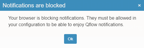
Fig. 510 Device notifications blocked in the browser warning.
Once the device notification preferences have been saved, you can always change them again in the “User configuration” menu, in the upper menu. If you disable notifications from the menu, these will be disabled for all devices. Alternatively, if you enable them, they will only be enabled for the device from which you are performing the action.
If device notifications are enabled, when you access the site from a new device, the option will be given to allow, or not, the reception of notifications in that particular device (Fig. 511). Keep in mind, just as before, the settings of the browser being used. If notifications are not enabled, no message will be shown.

Fig. 511 Message to enable notifications in the current device.
Time zone management
Qflow allows you to change the user time zone. This preference can be found in the upper menu, when you click on it, a panel will be displayed that allows you to select a new time zone.
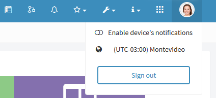
Fig. 512 Option to change the user’s time zone.
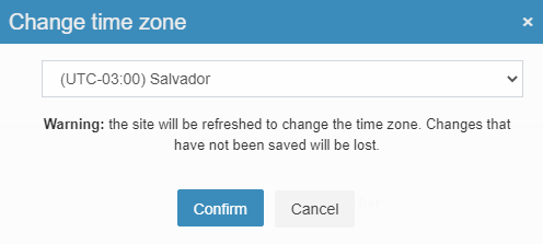
Fig. 513 Panel to select the user’s time zone.
If the time zone is changed, after refreshing the browser, all of the Qflow Task dates will be displayed in the selected time zone. That is, two users with different preferences may see different dates in the data of a flow, but they represent the same moment in time. A clarification of the user’s time zone offset can be found in the date and time selectors.
Fig. 514 Date and time selector.
Finally, if a date is displayed and it does not have any clarification, it can be assumed that it is in the user’s time zone.