Custom forms
Introduction
Custom forms allow you to visually define the structure and design of the forms used in one or more steps of the process. Their main function is to control the appearance, order, and organization of the fields displayed to the user when completing a task.
These forms are created from the form designer: a graphical tool that facilitates the simple and visual construction of interfaces integrated into different stages of the process. Once created, the form can be associated with one or more steps (user tasks or start events), thus determining when it will be displayed during execution.
Unlike other data entry mechanisms, a custom form does not modify the process logic or its execution rules. Its purpose is exclusively to define how the information is presented, with which labels, and under which visibility conditions.
Each form can be adapted to different contexts through specific rules configured for each field and each stage. This allows, for example, displaying a set of data at the beginning and hiding it or making it read-only in later phases.
Creating a custom form
To create a new custom form, select an existing process and choose a compatible element (such as a user task or a start event) to edit.
From the selected element:
Go to the properties panel.
In the Form section, select Create custom form.
Once created, the form is linked to the current version of the process.
A single form can be assigned to multiple elements (start event or user task) within the same process, but it cannot be reused in other processes.
Add and configure components to the form
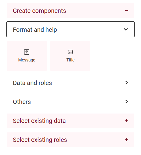
The form designer allows you to create forms easily. To start, you just need to drag and drop components from the left panel to the central area of the screen. These components are organized into categories such as “Format and help,” “Data and roles,” or “Others.” When you add a data-type component, the system will ask you to specify a name, which is mandatory. That data will be created in Qflow Design and will be available for reuse in other forms.
Depending on the component you choose, a field with the data (such as text, a list, or a checkbox) or a visual element (such as a separator or a container) will automatically be generated. These components do not contain information themselves but define how the form will look. Once added, you can move them within the view to organize the form structure according to your needs.
Components allow you to:
Visually represent form fields that will later be available during execution (such as text, numbers, dates, or options).
Organize the design structure through elements such as titles, messages, or separators.
Each component includes a gear icon that provides access to its properties panel. From there, you can configure visual and functional aspects such as the data name, domain, and visibility.
In the form designer, components are added from the left panel using drag and drop. Depending on their type, they can generate a new data field in Design, reuse an already defined one, or simply add visual elements without associating data.
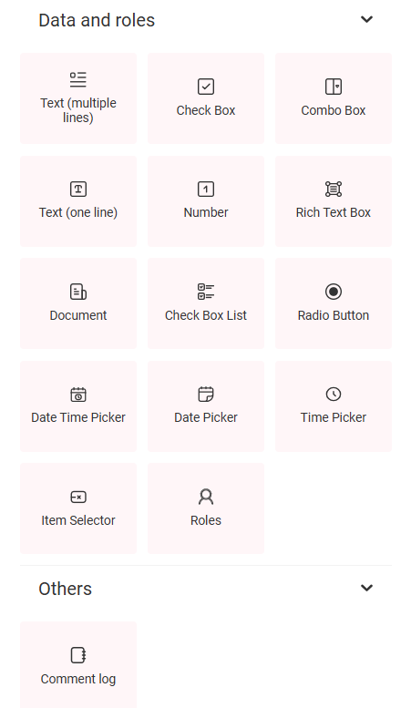
Components by data type (Text, Number, Combo Box, etc.): When dragging one of these components to the form, a new data field associated with the corresponding domain is created. In that case, you are asked to define a name to identify the data within the process. For more information about available domains, see the section Domains.
Role components: Allow you to load a role defined in the process and display it as a field in the form. This field can be used, for example, to dynamically assign a role to a user. Its visibility is configured from the same panel used for data, where you define whether the field will be visible, editable, required, or missing. For more information, see the section Process template roles.
Existing data and roles: Through the Select existing data or Select existing roles options, you can insert elements already defined in Design. These elements inherit their previous configurations. Within the form, their properties can be edited, and the changes made are also reflected in the design environment.
Note
If the domain of a data field is modified from Design, the change will be automatically applied to all forms that use that data. This ensures consistency between the central definition and its representation in the form.
Visual and auxiliary components
Title: Visual component that allows you to separate and name sections within the form.
Message: Used to display informational text or instructions to the user.
Comments log: Forms allow you to configure comments associated with the process, which the user can complete when submitting a task. These comments are not part of the structured data but allow recording relevant observations in the process log.
|
|
Note
Data defined in the template or in the version allows modifying its configuration within the form: name, domain, and visibility. The rest of the data only allows modifying its visibility (editable, required, read-only, or missing), but not its name or domain.
Form visibility and assignment:
The same form can be assigned to one or more elements of the process, provided they are a Start event, a User task or a User notification task, available in the top box. Also, it can also be assigned to Flow form or Flow edit form, available in the bottom box. This assignment is done from Design, using the properties panel of the corresponding element.
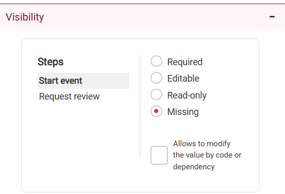
Field visibility is configured exclusively in the form designer, where you define how each data item will appear in each process step or flow forms: editable, required, read only, or hidden. For more information on these settings, see the Visibility of data, roles, attachments, and comments section.
Visibility |
Behavior |
|---|---|
Editable |
The field can be modified by the user. |
Required |
The field must be completed before proceeding. |
Read-only |
The value is displayed but cannot be edited. |
Missing |
The field is not displayed in that step. |
Below the visibility assignment, there is an additional control: the checkbox Allow modifying the value by code or dependency. This option determines whether the data can be updated automatically during process execution.
By dependencies: the value is calculated from other application data defined as domain parameters.
By code: the value can be modified in Code tasks, applying the logic configured in the process.
If the checkbox is not selected, the data value cannot be modified in code tasks or by dependencies and will be limited to user interaction according to the established visibility.
Example: in a leave form, the End date field can be completed automatically as Start date + number of requested days. This calculation can be performed either by a dependency configured in the form or by a Code task, provided the checkbox is selected.
Preview and testing on devices
From the designer, you can access a preview of the form before publishing the process.
To open it:
Click Preview, located in the upper right corner.
The form will open in a new tab, showing its current structure.
The preview lets you review:
The visual layout of the components.
How the form will look during execution.
During the preview, it is possible to interact with components (for example, enter text or select options), but these actions are not saved and do not affect the process.
Note
The preview does not evaluate validations, process logic, step-by-step visibility, or external integrations. It only represents the general visual structure of the form.
Testing on mobile devices with a QR code
Within the preview menu, there is the Scan QR option.
This feature generates a QR code that can be scanned from a mobile device or tablet to open the form. It allows validating the design and the experience on smaller screens.
The form opens respecting the current configuration.
It does not record data or execute the process.
The QR link is valid for 30 minutes.
Note
This feature allows validating the design on mobile or tablet environments. It cannot be used as a functional test of the flow.
Designer top bar
The top part of the designer includes global accesses and controls:
Form name: identifies the current form.
“Preview” button: opens the visual simulation of the form.
QR menu: allows you to generate a code to open the form on a mobile device.
Navigation (grid): direct access to Task, Admin, Design, and Team.
User menu: account and session settings.
All changes are saved automatically. For the form to be functional within the process, it is necessary to publish the version to which it was assigned.
Note
Publishing the process version is mandatory for the form to be executed in a real context.
Dependencies
Custom forms now allow the use of dependencies for the data, maintaining their usual behavior. For more information about these settings, see the section Dependencies.