Discover Qflow Task
Introduction
The main purpose of this tutorial is to briely explain how Qflow Task works. This tool allows users to initiate flows, interact with them and see their data.
Work with flows
The templates that have a production version set may be started within the “Start Flow” section in the left side menu.
Once a flow has started, tasks are generated for the people who participate in it. Consider the complaint handling flow outlined in the Qflow Design tutorial. In this case, some person or group of people is assigned the task of filing the complaint (those that start the process) or tending to it (those who the task reaches once started). These users will use Qflow Task in order to answer those tasks.
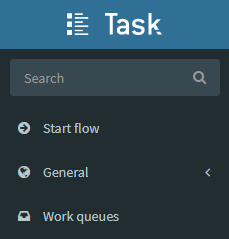
Start Flow
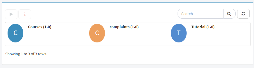
In this section all the templates that the user has available will appear. The user has to search for the one that they want to start, if there are many templates they can search by name in the “Search” field.
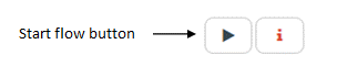
Then the user has to click the icon that represents the template or click the flow name and then click the “Start flow” button, that leads to the start flow form.
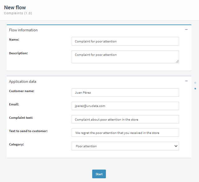
Then the user has to complete the start form, this includes entering the flow name, data, and possibly attach files and select who would perform certain roles.
Finally click “Start” and the flow will start.
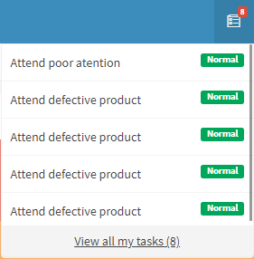
Tasks
If the user has pending tasks they will appear as pending to be resolved.
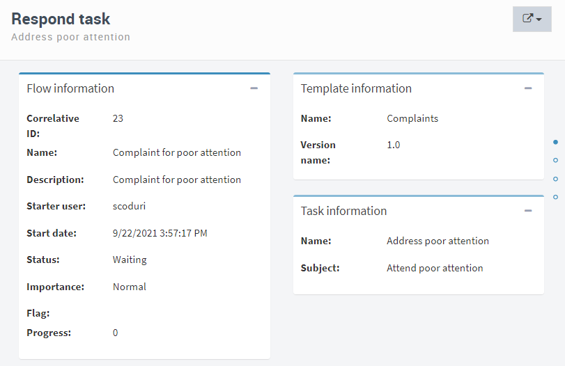
To answer a task, the user has to access it and complete some data so that the task can continue the flow.
Once the user accesses the task, its general data can be viewed, such as information of the flow, template and task. In the case that in the flow the application data scope has been defined as read only or editable, it can also be viewed and interacted with.
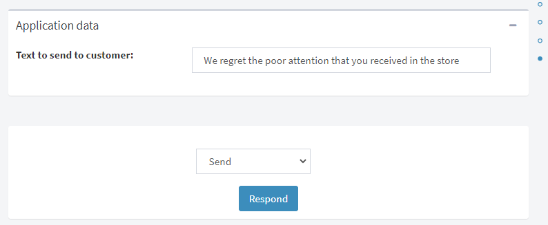
Finally, in order for the user to respond to the task, the option that was defined in the flow will appear.
In this example, taking into account that the complaint entered was due to poor attention and the user responsible for tending to it is the attention manager, they must send a message to the customer who entered the complaint. The message to send to the client can be edited by the manager or the one that was declared when the complaint was entered can be left.
Once the flow starts and the tasks are responded, you can access the “General” section and have access to general information about them.
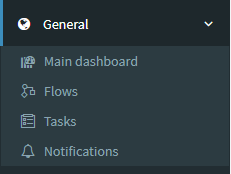
General
In this section the user will be able to see the following suboptions:
Main dashboard: in this section the user may configure a dashboard as the main one with views, charts and indicators. Dashboards will be explained in more depth in one of the following sections.
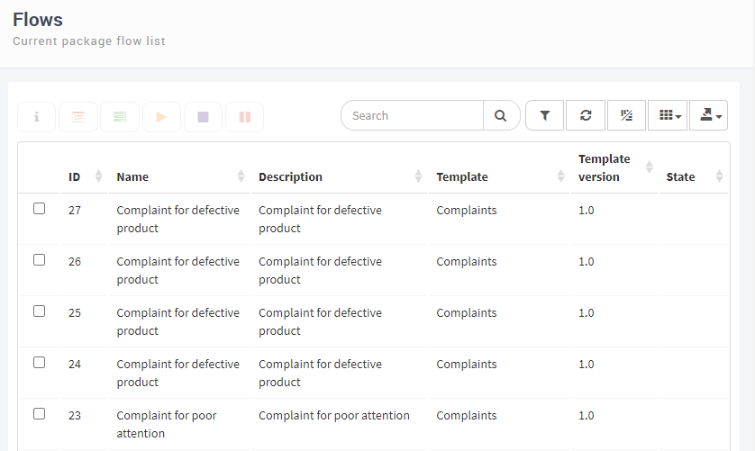
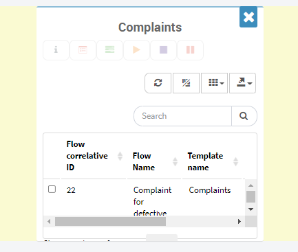
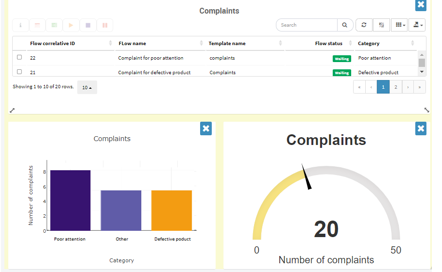
Flows: in this section all the flows that were initiated may be seen. In this example, all of the complaints entered to be addressed.
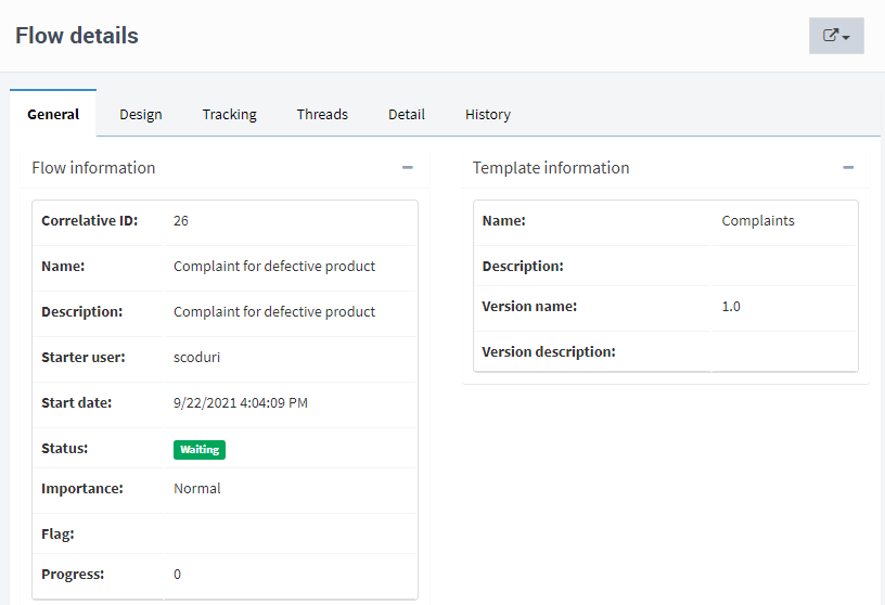
In addition to this, within this option the user can see the details of the flow, such as general information, which step of the flow the task is in, tracking, threads, detail and history. To access this information, select the task and click on the button with an “i”.
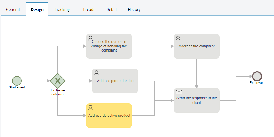
In the design section you can view the flow graph as the task progresses. For example, if the complaint is for a defective product and the user is in charge of dealing with the complaint, the graph will look as follows:
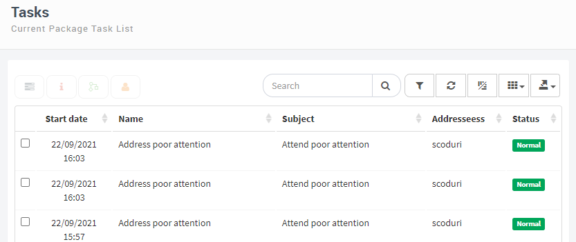
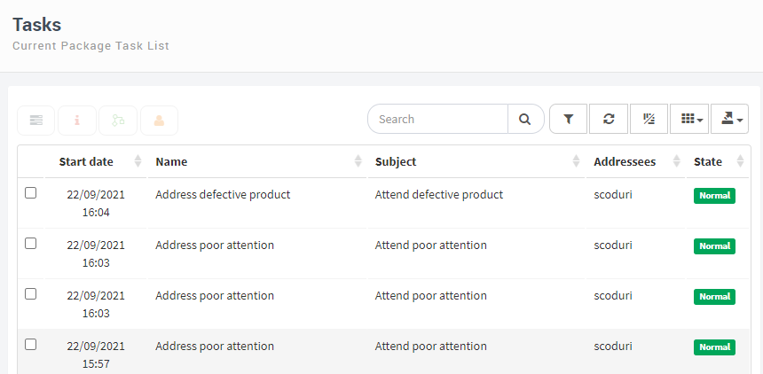
Tasks: in this section the user’s pending tasks will be displayed, in this example they are the pending complaint attention tasks.
Notifications: within this section the notifications that the user has are shown. For example, it could be that an expense request from a user is rejected and in this way the rejection notification would arrive.
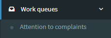
Work queues
In this section the user can see a list of the work queues to which they belong.
Tasks assigned to a work queue can be answered by any user who has permission to actuate on that queue.
Since these tasks are not assigned to any specific user, they do not appear in the “My Tasks” view of any of the users. The user can access them by clicking on the “Work Queues” section and once on that screen the user can access any of the tasks by selecting it. At the same time, the user may also access a work queue directly from the side menu by clicking on the small arrow, all the queues that the user has available will be shown.
In this example, when the complaint is not due to a defective product or poor attention the users responsible for handling the complaint could be many. In this way, a work queue is designed so that any of the users who have access can reply to it.
Once inside the queue task tray, the user can select the task to respond it. When they take it, other users will not be able to work on it, preventing two users from working simultaneously on the same task.
Tracking tools and flow analisis
Once tasks have been entered and interacted with, different options can be designed in order to see their behavior.
Some elements will be described that allow for an easier follow-up of the flow, as well as the organization of its information. These elements are:
Views
Charts
Indicators
Dashboards
Views
A view is the definition of a set of elements (for example, a set of flows or tasks), including the order in which they are displayed, and which columns and elements will be seen. For example, a criterion to create a flow view may be that the flows belonging to that view have been started on a certain date.
Create a view
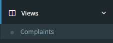
When creating a view, the user can define whether it will be shown in the side menu or not. The views that are included in the side menu are shown as suboptions of that menu’s “Views” option. The other views are accessible from the views screen, which is accessed by clicking on the “Views” option.
A view may be created from scratch or an existing view may also be copied. By clicking on the add view button “+”, Qflow will display the following window.
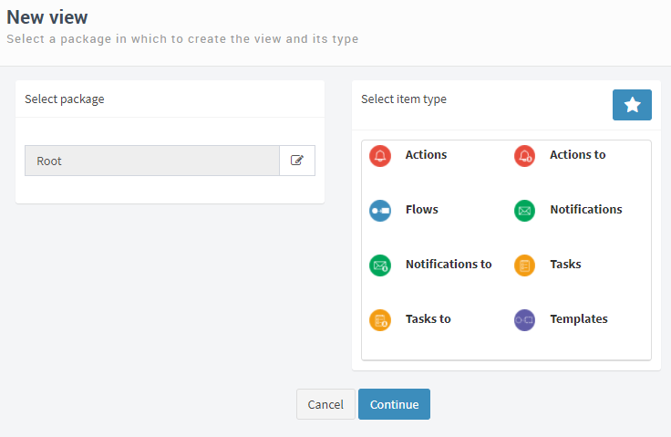
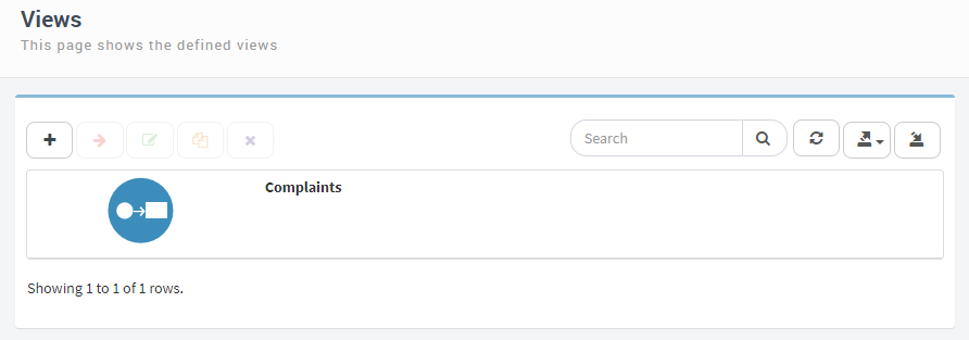
In this example, a view will be created to see the complaints entered. The elements that must be defined are:
1) The package that the view will belong to: a view belongs to a certain package, in the same way as the flow templates, in this case it will be created in the operations package
2) The type of view: this indicates what type of item the view contains. Initially the public items are shown, they are shown if the user has permissions for the selected package. Clicking on the star icon will show the personal items. These views can only be accessed by the user who created them.
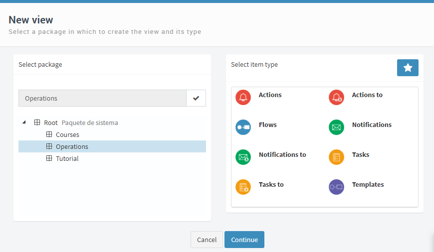
Once the package and view type have been selected, click the “Continue” button. This leads to the view definition window.
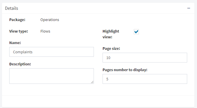
In the view definition different sections must be completed:
Details
Columns
Filters
Sort
Parameters
Permissions
Details
This section shows the package and the view type and allows the user to define the name, description, whether it is a highlighted view (display the view in the navegation tree), page size and number of pages to display.
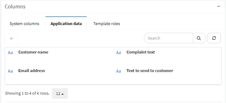
Columns
Views are shown as tables and this section allows the user to define which columns are going to be seen in the view’s table. Column properties can be removed or modified by selecting them.
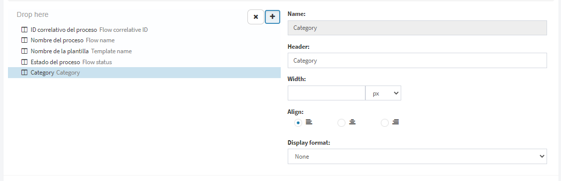
In order to add another column to the view click on the “+” button, this will display a box that shows a list of the available columns. They are grouped into “System columns”, “Application data” and “Template roles”, to add one of them double click or click and drag it where it says “Drop here”.
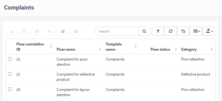
In this example, the application data “Category” will be added, in addition to the columns that are already set by default.
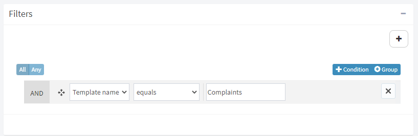
Filters
This section allows you to specify which properties an item must have to be included in the view. There are complex filters, you are allowed to build combinations of filter conditions. Filters in a view can specify conditions for multiple columns, and in various combinations.
The “+” button shows all the columns available to add the filters and they are selected by dragging the column to where it says “Drag here”. When the column has been added, it can be selected from the drop-down list.
Once selected, the operators that can be used appear in a drop-down list, “equal”, “different”, “less than”, among others.
Then next to the operator, the field to which you want to add the filter is added. For example, “Template name”, “equal”, “Complaints”
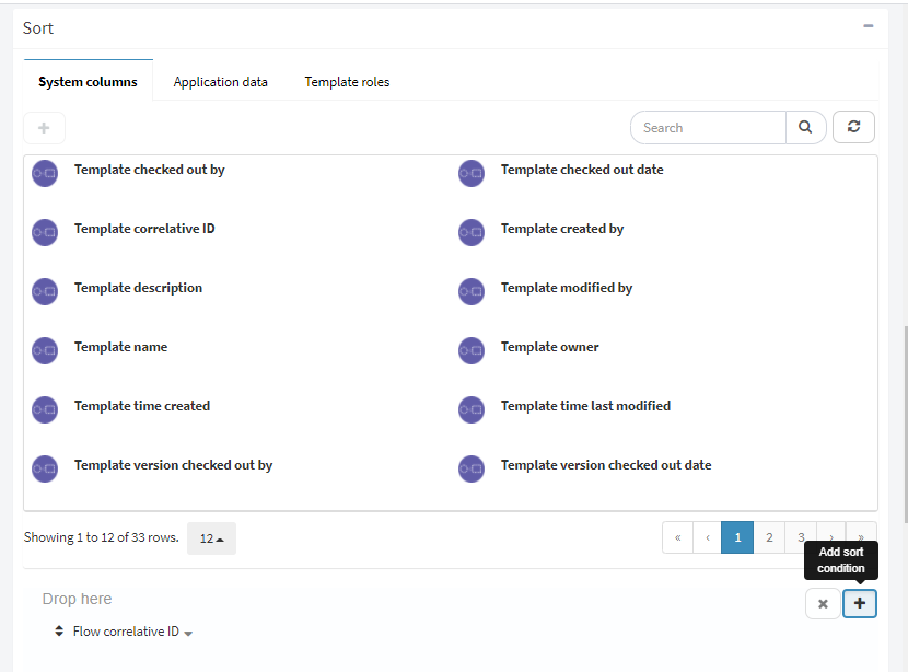
Sort
This section allows the user to specify in what order the elements of the view should be displayed. When a view is created, a sort criterion is included by default, these can be modified or deleted by clicking on the criterion. The procedure of adding a criterion is similar to that of adding a column, the user has to click on the criterion and a window with options to select is displayed.
In this example, the sort criteria will be by flow correlative ID in descending order.
Parameters
In this section the user may define filter conditions that instead of comparing the value of a column with a fixed value, compare it with a value that a user enters when seeing the view.
It is added similar to all the previous ones, the “+” button is clicked and the available columns are displayed, they are selected by dragging them. Once added, by clicking on them you can see and modify their properties.
Tthis example, however, does not include any parameters.
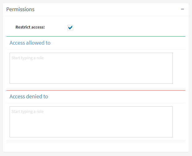
Permissions
This section allows the user to restrict the set of people who can see a view. It is only available for public items since personal items can only be seen by the user who created them.
Select the “Restrict access” button and then where it says “Access allowed to” start typing the role to which you want to restrict access.
When the user has finished modifying the properties of each of these sections, the “Done” button must be clicked. Qflow will validate the data, and if there are errors, you will be notified. If you click on the error message, Qflow will take you to the part of the screen where you can correct the error.
The final result of the view will look like this:
Charts
Qflow allows the user to create charts of various types to facilitate the visualization of flow data. In the same way as the views, for every chart you can define if it will be displayed in the side menu as a suboption of the “Chart” option or by accessing the “Chart” section.
The steps to create a chart are similar to the ones for the views. By clicking on the “+” button a new window will open where the user has to select the package where the chart will be created and the item type. The items are the same as the ones of the views. They are classified as public or personal. Nevertheless, two more items are added.
See the creation of a view (Create a view) for more details on the steps to follow to create a view.
The window where the chart is created has the following sections: (all the sections except “Appearance”, “Measure” y “Dimensions” are detailed in the definition of the creation of Views):
Details
Appearance
Measure
Dimensions
Columns
Filters
Sort
Parameters
Permissions
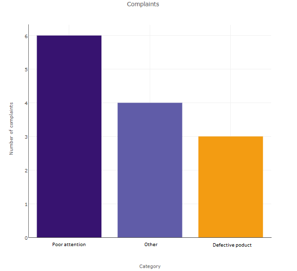
For this example a clustered column chart will be created to be able to visualize the reasons for the complaints: poor attention, defective product or another reason.
In the details section the chart will be named “Complaints”. Within the Columns section the “Category” application data is added and then all the rest of the sections are created in the same way as they were created in the view.
Appearance
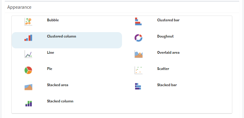
In this section the user may choose the chart type, for example a line, pie, among others.
The available types are: bubble, clustered bar, clustered column, doughnut, line, overlaid area, pie, scatter, stacked area, stacked bars and stacked columns.
Fot this example the clustered columns option will be selected.
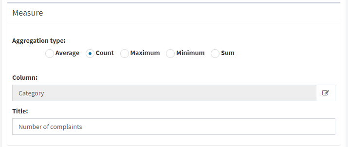
Measure
The measure defines the values that are displayed graphically. For example: in a stacked columns chart, the measure will be the value that will be used to calculate the height of each bar.
The measure is created by the definition of a column and an aggregation type. The column will be numeric unless “Count” is used as the aggregation type.
The type of aggregation defines how the indicated column will be used to calculate the values to be used in the chart. The options are:
Count: indicates that the non-null values of the column indicated in “Measure” should be counted. For example, if the user wants to create a chart that shows how many flows each user has started, the aggregation type “Count” can be used with the “Template correlative ID” measure. The dimension would be the “User who started the process” column.
Maximum: from the indicated column, the maximum value is taken. For example, if for the measure an application datum is chosen as a column, the chart will display the maximum value of that application datum.
Minimum: from the indicated column, the minimum value is taken.
Average: The chart displays the average value of the values that the column has as a measure.
Sum: the chart displays the sum of the values that the column has as measure.
In order to choose a column, the user has to click on the button that appears on the left in the “Column” field and there a list with all the available columns will be displayed. Double click to select the one you want, to change it do the same again.
For this example, the aggregation type will be count and the column will be the “Complaint category” application datum.
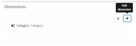
Dimensions
Within this section the columns that define the values that are related to the measure are defined. All charts have at least one dimension, but for some you can define several.
The steps to add a dimension are similar to those of adding a column that were defined in the Views section. Click on the “+” button and all the possible options will be displayed, double-click on the one you want to add or drag the option to where it says “Drag here”.
If there is more than one dimension, the order of the dimensions that are added does matter. For example, in a two-dimensional stacked column chart, the first dimension is used to determine the values that go on the horizontal axis, and the second to determine the categories into which each column is subdivided.
In this example, only one dimension will be used, which is the category of the complaint.
Once all the properties have been defined, click on the “Done” button.
The final result of the graph will look like this:
Indicators
Qflow allows you to create indicators that make calculations with the data of the flows and reach a result that is represented by a number and a figure that adds meaning.
As with the views and charts, you can define whether the indicator appears as a suboption of the “Indicators” option or not.
The process to create an indicator is very similar to that of views and graphs, a new one is created by clicking on the “+” button, then the package where the graph will be created and the type of item to be used must be selected. The types of items available are the same as those available for charts.
The window where an indicator is created has the following sections: (all the sections except “Details”, “Range”, and “Formula” are detailed in the definition of the creation of Views):
Details
Ranges
Formulas
Filters
Parameters
Permissions
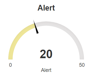
For this tutorial, an indicator that shows how many complaints are being entered will be created.
Parameters and Permissions sections are defined the same as the previous examples. Leaving Parameters and Permissions empty and Filters with template name equal to “Complaints”.
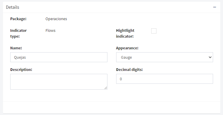
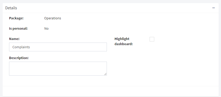
Details
This section is similar to the views section, but contains two more properties:
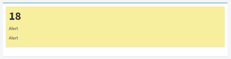
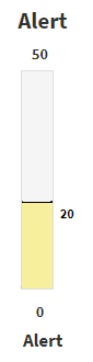
- Appearance: indicates the figure that will be used to represent the indicator:
Gauge: a needle that marks a value on a scale divided by different colors
Semaphore: the value is displayed on a background of the color corresponding to the range to which it belongs
Thermometer: the drawing of a thermometer is shown that marks the value that is represented.
- Decimal digits: the number of decimal digits that will be taken into account for the meter calculation result
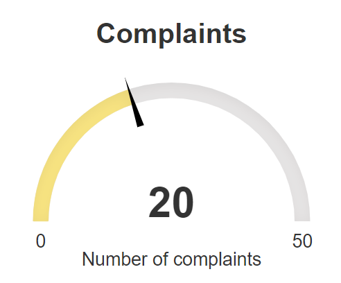
For this example, the Gauge is selected as appearance.
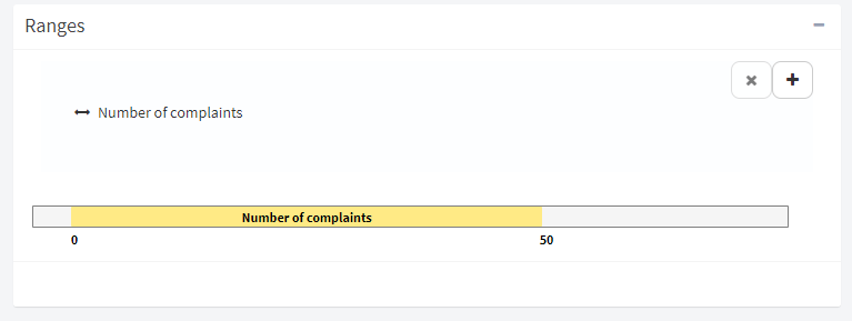
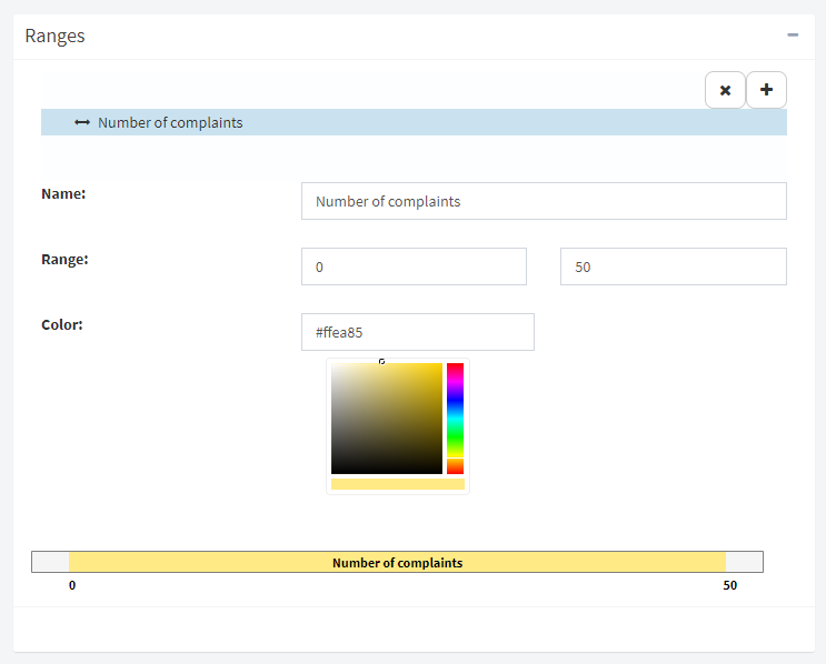
Ranges
Within this section, the ranges that allow categorizing the values that the indicator will display are defined. Each range is associated with a color. In the previous figures, the value shown in the indicators is in a range that was associated with the color yellow.
To add a range, click on the “+” button, this will add ranges to the list of ranges that are displayed in a bar. The first range added to the bar is shown with a default name, any color and with limit values of 0 and 50, these properties can be modified by clicking on the range.
Formula
This section defines how to calculate the value displayed on the indicator. The formula is represented by a tree that has a node for each operation and for each operand.
In the example, the correlative identifier of the process will be used as a formula to count the number of complaints entered. The tree is defined from the root, at the top, down. Therefore, the last operation that is executed (root) is defined first, which is the one that results in the indicated value. In this case the number of initialized processes.
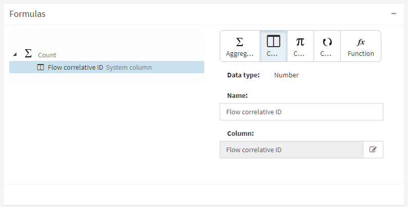
The nodes in the tree can be of various types, each of which is associated with a type of operation or operand. In the tree, the type of a node is represented by an icon.

Aggregation: an aggregation node is an operation that takes a set of data and uses it to calculate a value. It can be an average, count, maximum, minimum, or sum.
Column: a system column or application data. A column determines a set of data that can be used as input to an aggregation operation.
Constant: a fixed value of some kind.
Conversion: operation that converts the input parameter to the data type expected by the operation that uses its result as input.
Function: A function takes parameters and applies some standard function to them, such as arithmetic operations. There are also date or string manipulation functions.
The final result of the indicator will look like this:
Dashboards
A dashboard is a page that combines Views, Indicators and Charts. Like the views, charts and indicators it can be seen as a suboption of the option “Dashboard” or not. The steps to create a dashboard are similar to the other sections, clicking on the “+” button displays the option to select within which package the dashboard is going to be created and determine if it is going to be a public or personal one. The different options appear by clicking the star button.
For this tutorial, a dashboard will be created that shows information about the complaint flow with the view, chart, and indicator that were created earlier.
The dashboard creation screen has the following sections:
Details
The details of the dashboard are similar to those of the views: they include its name, its description, and a field that allows you to indicate whether the dashboard should be included in the side menu (“Highlight dashboard”).
Permissions
There is more than one permission for a board, since the page on which a board is viewed is also the page on which you edit it to decide what elements it is composed of. The permissions of a board indicate if it can be seen, but also if it can be modified. When adding a member to the list of members with permissions, a table appears in which it must be marked “Allowed” or “Denied” for each permission.
Modifying what is displayed on the dashboard
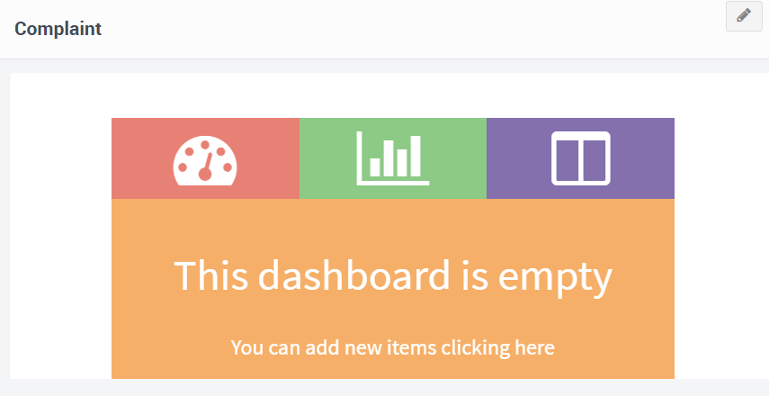
To define which elements are displayed on a board, the same page on which the board is viewed is used. Only users who have permission to modify the dashboard can change the items displayed on it
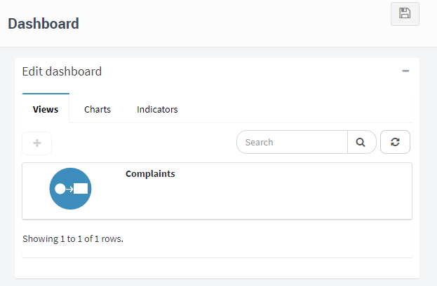
If the board is empty it will be indicated on the screen and to add items click on the link that says “Add new items by clicking here” or on the pencil button at the top right. Then, Qflow will show the available elements, each type in a tab (views, charts and indicators).
To add an item, double click on it or select it and click the “+” button above.
Once the element has been selected, you can delete it with the cross on the top right or you can modify how it will be displayed on the screen. Generally, its size will have to be modified, it can be done with any of the two arrows that appear in the lower corners of the element. Keep the mouse button pressed, and move it until the element reaches the desired size.
You can add as many elements as you want and once the editing is finished, click on the “Save” button located at the top right.
Finally, the dashboard will look like this:
Finally, if you want more information that was not detailed in this tutorial, you can see the Qflow Task manual.